
Interactive Product Catalogue
UX/UI design of an offline digital sales tool for French Sales Team
" width="90px"><path d="M 0 30 L 0 0 L 90 0 L 90 30 Z" fill="transparent" height="30px" id="ZRBL04_SW" width="90px"/><path d="M 0 0 L 90 0 L 47.748 29.212 C 46.233 30.26 43.773 30.26 42.252 29.212 Z" fill="rgb(255, 255, 255)" height="29.997749999999996px" id="TZYYm46Wn" width="90px"/></g></svg>)
Interactive Catalogue
UX/UI design of an offline digital sales tool for French Sales Team
Interactive Catalogue
UX/UI design of an offline digital sales tool for French Sales Team
Project dates: July 2023 - September 2024
Customer: Bimeda Animal Health Ltd
Project dates: July 2023 - September 2024
Customer: Bimeda Animal Health Ltd
Project dates: July 2023 - September 2024
Customer: Bimeda Animal Health Ltd

Project Overview
Project Overview
This digital interactive product catalogue was created for our French sales team to support the promotion of animal health products to clients – primarily veterinarians and farmers. The goal was to provide a clear, easy-to-use, and professional tool that would work both online and offline, allowing the team to present detailed product information in a more engaging way.
The project objective was to design a user-friendly interactive catalogue that:
● organises a large volume of product information clearly;
● allows easy navigation, similar to a website;
● works offline while still offering external links to legal product data when an internet connection is available;
● helps the sales team communicate product details efficiently during field visits and customer meetings.
This digital interactive product catalogue was created for our French sales team to support the promotion of animal health products to clients – primarily veterinarians and farmers. The goal was to provide a clear, easy-to-use, and professional tool that would work both online and offline, allowing the team to present detailed product information in a more engaging way.
The project objective was to design an intuitive interactive catalogue that:
● organises a large volume of product information clearly;
● allows easy navigation, similar to a website;
● works offline while still offering external links to legal product data when an internet connection is available;
● helps the sales team communicate product details efficiently during field visits and customer meetings.
This digital interactive product catalogue was created for our French sales team to support the promotion of animal health products to clients – primarily veterinarians and farmers. The goal was to provide a clear, easy-to-use, and professional tool that would work both online and offline, allowing the team to present detailed product information in a more engaging way.
The project objective was to design a user-friendly interactive catalogue that:
● organises a large volume of product information clearly;
● allows easy navigation, similar to a website;
● works offline while still offering external links to legal product data when an internet connection is available;
● helps the sales team communicate product details efficiently during field visits and customer meetings.

Research & Analysis
Research &
Analysis
Research &
Analysis

Structure & Content
Structure &
Content
Structure &
Content

Interactive Design
Interactive
Design
Interactive
Design

Visual & UI Design
Visual & UI
Design
Visual & UI
Design
UX/UI Design Approach
UX/UI Design Approach
01
01
Research & Analysis
Research & Analysis
Although in-depth research wasn’t possible due to project constraints, I used quick and practical methods to guide the design:
Although in-depth research wasn’t possible due to project constraints, I used quick and practical methods to guide the design:
Team Feedback
I consulted with colleagues from the French sales team to better understand their existing process for sharing product information. They highlighted that relying on a combination of printed materials and external websites often created delays and disruptions – particularly during client visits in remote areas where internet access could be limited.
Team Feedback
I consulted with colleagues from the French sales team to better understand their existing process for sharing product information. They highlighted that relying on a combination of printed materials and external websites often created delays and disruptions – particularly during client visits in remote areas where internet access could be limited.
Team Feedback
I consulted with colleagues from the French sales team to better understand their existing process for sharing product information.
They highlighted that relying on a combination of printed materials and external websites often created delays and disruptions – particularly during client visits in remote areas where internet access could be limited.
Reviewing Similar Tools
I reviewed catalogues and brochures from other companies in the animal health sector to assess common design approaches. Many lacked a clear structure or functional navigation, with layouts that were either overly dense or overly simplistic. This analysis helped identify gaps in usability and informed key areas for improvement in our own catalogue.
Reviewing Similar Tools
I reviewed catalogues and brochures from other companies in the animal health sector to assess common design approaches. Many lacked a clear structure or functional navigation, with layouts that were either overly dense or overly simplistic. This analysis helped identify gaps in usability and informed key areas for improvement in our own catalogue.
Reviewing Similar Tools
I reviewed catalogues and brochures from other companies in the animal health sector to assess common design approaches. Many lacked a clear structure or functional navigation, with layouts that were either overly dense or overly simplistic.
This analysis helped identify gaps in usability and informed key areas for improvement in our own catalogue.
Product Data Audit
In collaboration with the French department’s sales lead, I reviewed internal product sheets to identify the most relevant information for clients – including product form, packaging size, brief descriptions, and legal references. This process helped us define a consistent table structure and determine which elements should be included within the catalogue versus linked externally.
Product Data Audit
In collaboration with the French department’s sales lead, I reviewed internal product sheets to identify the most relevant information for clients – including product form, packaging size, brief descriptions, and legal references. This process helped us define a consistent table structure and determine which elements should be included within the catalogue versus linked externally.
Product Data Audit
In collaboration with the French department’s sales lead, I reviewed internal product sheets to identify the most relevant information for clients – including product form, packaging size, brief descriptions, and legal references.
This process helped us define a consistent table structure and determine which elements should be included within the catalogue versus linked externally.
User Scenarios
Based on typical usage scenarios discussed with the sales team, we considered how the catalogue would be used in real-world contexts – for example, a veterinarian needing quick access to product details during a client visit, or a farmer browsing product options without internet connectivity. These insights informed decisions around offline functionality and ensured that essential information remained easily accessible through internal navigation within the PDF.
User Scenarios
Based on typical usage scenarios discussed with the sales team, we considered how the catalogue would be used in real-world contexts – for example, a veterinarian needing quick access to product details during a client visit, or a farmer browsing product options without internet connectivity. These insights informed decisions around offline functionality and ensured that essential information remained easily accessible through internal navigation within the PDF.
User Scenarios
Based on typical usage scenarios discussed with the sales team, we considered how the catalogue would be used in real-world contexts – for example, a veterinarian needing quick access to product details during a client visit, or a farmer browsing product options without internet connectivity.
These insights informed decisions around offline functionality and ensured that essential information remained easily accessible through internal navigation within the PDF.
Readability & Usability
The catalogue was designed for use on desktop devices and wide-screen tablets, ensuring optimal readability and ease of interaction. I followed established usability principles related to button sizing, layout clarity, and visual hierarchy to support a clean, minimal, and intuitive interface that guides users naturally through the content.
Readability & Usability
The catalogue was designed for use on desktop devices and wide-screen tablets, ensuring optimal readability and ease of interaction. I followed established usability principles related to button sizing, layout clarity, and visual hierarchy to support a clean, minimal, and intuitive interface that guides users naturally through the content.
Readability & Usability
The catalogue was designed for use on desktop devices and wide-screen tablets, ensuring optimal readability and ease of interaction.
I followed established usability principles related to button sizing, layout clarity, and visual hierarchy to support a clean, minimal, and intuitive interface that guides users naturally through the content.

Research & Analysis
Research &
Analysis
Research &
Analysis

Structure & Content
Structure &
Content
Structure &
Content
Interactive Design
Interactive
Design
Interactive
Design
Visual & UI Design
Visual & UI
Design
Visual & UI
Design
02
02
Structure & Content
Structure & Content


The catalogue is built around clear structure and logic:
The catalogue is built around clear structure and logic:
Grouped by Species and Product Category
Products are divided first by animal species – cattle, sheep, goats, horses, pigs, dogs and cats – and then further categorised by type of product. Categories include medicinal (such as antiparasitic, anti-inflammatory, and antibiotics) and non-medicinal products (including trace elements & vitamins, metabolism support, milk replacers, hygiene & environmental care). This dual structure makes it easier for users to browse relevant products based on their specific needs.
Grouped by Species and Product Category
Products are divided first by animal species – cattle, sheep, goats, horses, pigs, dogs and cats – and then further categorised by type of product. Categories include medicinal (antiparasitic, anti-inflammatory, antibiotics) and non-medicinal products (trace elements & vitamins, metabolism support, milk replacers, hygiene & environmental care). This dual structure makes it easier for users to browse relevant products based on their specific needs.
Grouped by Species and Product Category
Products are divided first by animal species – cattle, sheep, goats, horses, pigs, dogs and cats – and then further categorised by type of product.
Categories include medicinal and non-medicinal products, with 4 subcategories under each group. This dual structure makes it easier for users to browse relevant products based on their specific needs.
Table Format
Each section contains tables with key product details: product name, short description, form (e.g., liquid, powder), packaging, and a direct link to the Med’Vet legal portal. Some rows are linked to extended content.
Table Format
Each section contains tables with key product details: product name, short description, form (e.g., liquid, powder), packaging, and a direct link to the Med’Vet legal portal. Some rows are linked to extended content.
Table Format
Each section contains tables with key product details: product name, short description, form (e.g., liquid, powder), packaging, and a direct link to the Med’Vet legal portal. Some rows are linked to extended content.
Detailed Product Pages
In addition to the main tables, selected products have dedicated subpages that include more detailed information and product images. These pages provide a deeper understanding of products where additional content is especially helpful for decision-making or product positioning.
Detailed Product Pages
In addition to the main tables, selected products have dedicated subpages that include more detailed information and product images. These pages provide a deeper understanding of products where additional content is especially helpful for decision-making or product positioning.
Detailed Product Pages
In addition to the main tables, selected products have dedicated subpages that include more detailed information and product images.
These pages provide a deeper understanding of products where additional content is especially helpful for decision-making or product positioning.
Research & Analysis
Research &
Analysis
Research &
Analysis
Structure & Content
Structure &
Content
Structure &
Content

Interactive Design
Interactive
Design
Interactive
Design
Visual & UI Design
Visual & UI
Design
Visual & UI
Design
03
03
Interactive Design
Interactive Design

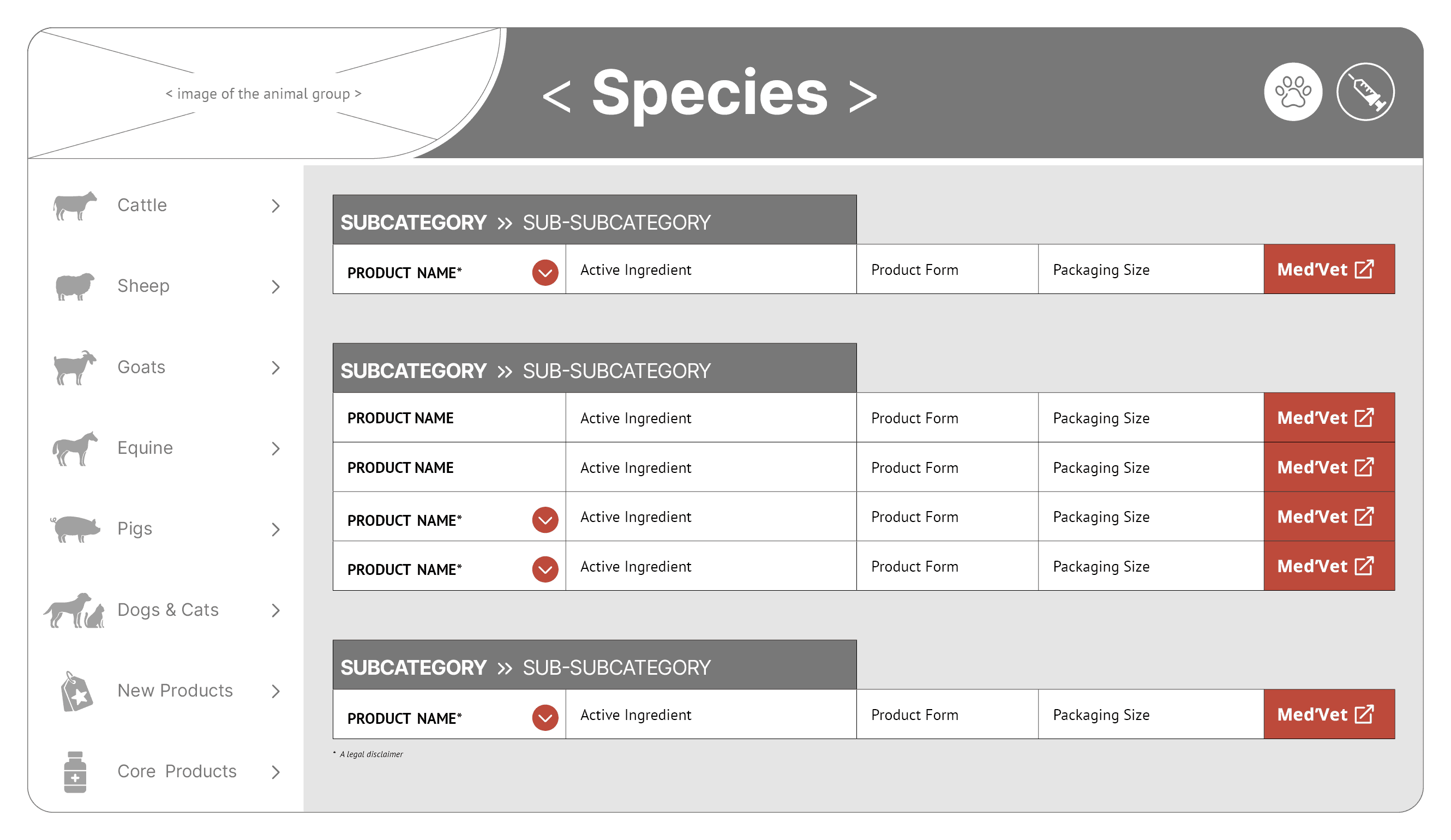

The document was created in Adobe InDesign and includes fully embedded interactive elements designed to enhance usability and accessibility.
The document was created in Adobe InDesign and includes fully embedded interactive elements designed to enhance usability and accessibility.
Navigation Menu
A persistent left-side navigation menu allows users to move between key sections of the catalogue – grouped by species (e.g., cattle, pigs, pets, etc.) – with additional two buttons: for newly launched products and regular product lines. The menu is designed to create a familiar, website-like navigation experience within the PDF.
Navigation Menu
A persistent left-side navigation menu allows users to move between key sections of the catalogue – grouped by species (e.g., cattle, pigs, pets, etc.) – with additional two buttons: for newly launched products and regular product lines. The menu is designed to create a familiar, website-like navigation experience within the PDF.
Navigation Menu
A persistent left-side navigation menu allows users to move between key sections of the catalogue – grouped by species (e.g., cattle, pigs, pets, etc.) – with additional two buttons: for newly launched products and regular product lines. The menu is designed to create a familiar, website-like navigation experience within the PDF.
Category Menu
Each species section contains its own secondary category menu, with subcategories presented as clickable buttons to enable users to quickly navigate to the specific type of product they need. Products are grouped under two main categories:
1. Medicinal Products: antiparasitics, anti-inflammatories, antibiotics, other.
2. Non-Medicinal Products: trace elements & vitamins, metabolism support, milk replacers, hygiene & environment.
Category Menu
Each species section contains its own secondary category menu, with subcategories presented as clickable buttons to enable users to quickly navigate to the specific type of product they need. Products are grouped under two main categories: medicinal (antiparasitic, anti-inflammatory, antibiotics) and non-medicinal products (trace elements & vitamins, metabolism support, milk replacers, hygiene & environmental care).
Category Menu
Each species section contains its own secondary category menu, with subcategories presented as clickable buttons to enable users to quickly navigate to the specific type of product they need.
Products are grouped under two main categories: medicinal (antiparasitic, anti-inflammatory, antibiotics) and non-medicinal products (trace elements & vitamins, metabolism support, milk replacers, hygiene & environmental care).
Clickable Buttons and Links
Product entries feature two types of buttons to support easy navigation: those on the right side of tables link to the Med’Vet portal for legal and regulatory information, while others near certain product names open detailed product pages within the catalogue. Each of these product pages includes a return button in the top left corner, letting users go back to the previous table. These interactive elements provide quick access to both extended product content and official data.
Clickable Buttons and Links
Product entries feature two types of buttons to support easy navigation: those on the right side of tables link to the Med’Vet portal for legal and regulatory information, while others near certain product names open detailed product pages within the catalogue. Each of these product pages includes a return button in the top left corner, letting users go back to the previous table. These interactive elements provide quick access to both extended product content and official data.
Clickable Buttons and Links
Product entries feature two types of buttons to support easy navigation: those on the right side of tables link to the Med’Vet portal for legal and regulatory information, while others near certain product names open detailed product pages within the catalogue.
Each of these product pages includes a return button in the top left corner, letting users go back to the previous table. These interactive elements provide quick access to both extended product content and official data.
Research & Analysis
Research &
Analysis
Research &
Analysis
Structure & Content
Structure &
Content
Structure &
Content
Interactive Design
Interactive
Design
Interactive
Design

Visual & UI Design
Visual & UI
Design
Visual & UI
Design
04
04
Visual & UI Design
Visual & UI Design


The visual style was kept clean and simple:
The visual style was kept clean and simple:
Minimalist Interface
A flat UI design with a minimal color palette and clear layouts helped avoid visual clutter. This approach prioritises content over decoration, making it easier for users to focus on essential product information. It also aligns with modern digital design standards, ensuring a familiar and efficient user experience.
Minimalist Interface
A flat UI design with a minimal color palette and clear layouts helped avoid visual clutter. This approach prioritises content over decoration, making it easier for users to focus on essential product information. It also aligns with modern digital design standards, ensuring a familiar and efficient user experience.
Minimalist Interface
A flat UI design with a minimal color palette and clear layouts helped avoid visual clutter. This approach prioritises content over decoration, making it easier for users to focus on essential product information. It also aligns with modern digital design standards, ensuring a familiar and efficient user experience.
Brand-Aligned Colour System
The color system uses three main shades – paled red, navy, and dusty teal – derived from Bimeda’s core brand colors (red, navy, and teal). These muted tones were specifically chosen to be subtle and easy on the eyes, avoiding visual irritation. This visual consistency reinforces brand recognition while supporting prolonged viewing without causing fatigue.
Brand-Aligned Colour System
The color system uses three main shades – paled red, navy, and dusty teal – derived from Bimeda’s core brand colors (red, navy, and teal). These muted tones were specifically chosen to be subtle and easy on the eyes, avoiding visual irritation. This visual consistency reinforces brand recognition while supporting prolonged viewing without causing fatigue.
Brand-Aligned Colour System
The color system uses three main shades – paled red, navy, and dusty teal – derived from Bimeda’s core brand colors (red, navy, and teal). These muted tones were specifically chosen to be subtle and easy on the eyes, avoiding visual irritation. This visual consistency reinforces brand recognition while supporting prolonged viewing without causing fatigue.
Consistent Visual Language
Consistent typography, spacing, and button styles contribute to a professional appearance and enhance readability.
The type hierarchy and layout rules were applied across all sections to unify the design and support intuitive navigation.
This consistency not only improves usability but also reinforces the tool’s quality and attention to detail
Consistent Visual Language
Consistent typography, spacing, and button styles contribute to a professional appearance and enhance readability.
The type hierarchy and layout rules were applied across all sections to unify the design and support intuitive navigation.
This consistency not only improves usability but also reinforces the tool’s quality and attention to detail
Consistent Visual Language
Consistent typography, spacing, and button styles contribute to a professional appearance and enhance readability.
The type hierarchy and layout rules were applied across all sections to unify the design and support intuitive navigation.
This consistency not only improves usability but also reinforces the tool’s quality and attention to detail
Balanced Layout
Every element was carefully placed to balance information density with clarity. Tables, buttons, and navigation components were arranged to minimise user effort while scanning and interacting with content. Special attention was given to alignment and spacing to ensure the interface remains structured, even with varied data lengths and product types.
Balanced Layout
Every element was carefully placed to balance information density with clarity. Tables, buttons, and navigation components were arranged to minimise user effort while scanning and interacting with content. Special attention was given to alignment and spacing to ensure the interface remains structured, even with varied data lengths and product types.
Balanced Layout
Every element was carefully placed to balance information density with clarity. Tables, buttons, and navigation components were arranged to minimise user effort while scanning and interacting with content. Special attention was given to alignment and spacing to ensure the interface remains structured, even with varied data lengths and product types.
Outcome
Outcome
The final result is a practical and polished interactive catalogue that helps the French sales team present products more effectively. It combines a structured layout with smooth navigation and smart interactivity - all while being lightweight enough to work offline. The project shows how thoughtful UX and UI design can turn a static PDF into a modern, useful sales tool.
The final result is a practical and polished interactive catalogue that helps the French sales team present products more effectively. It combines a structured layout with smooth navigation and smart interactivity - all while being lightweight enough to work offline. The project shows how thoughtful UX and UI design can turn a static PDF into a modern, useful sales tool.
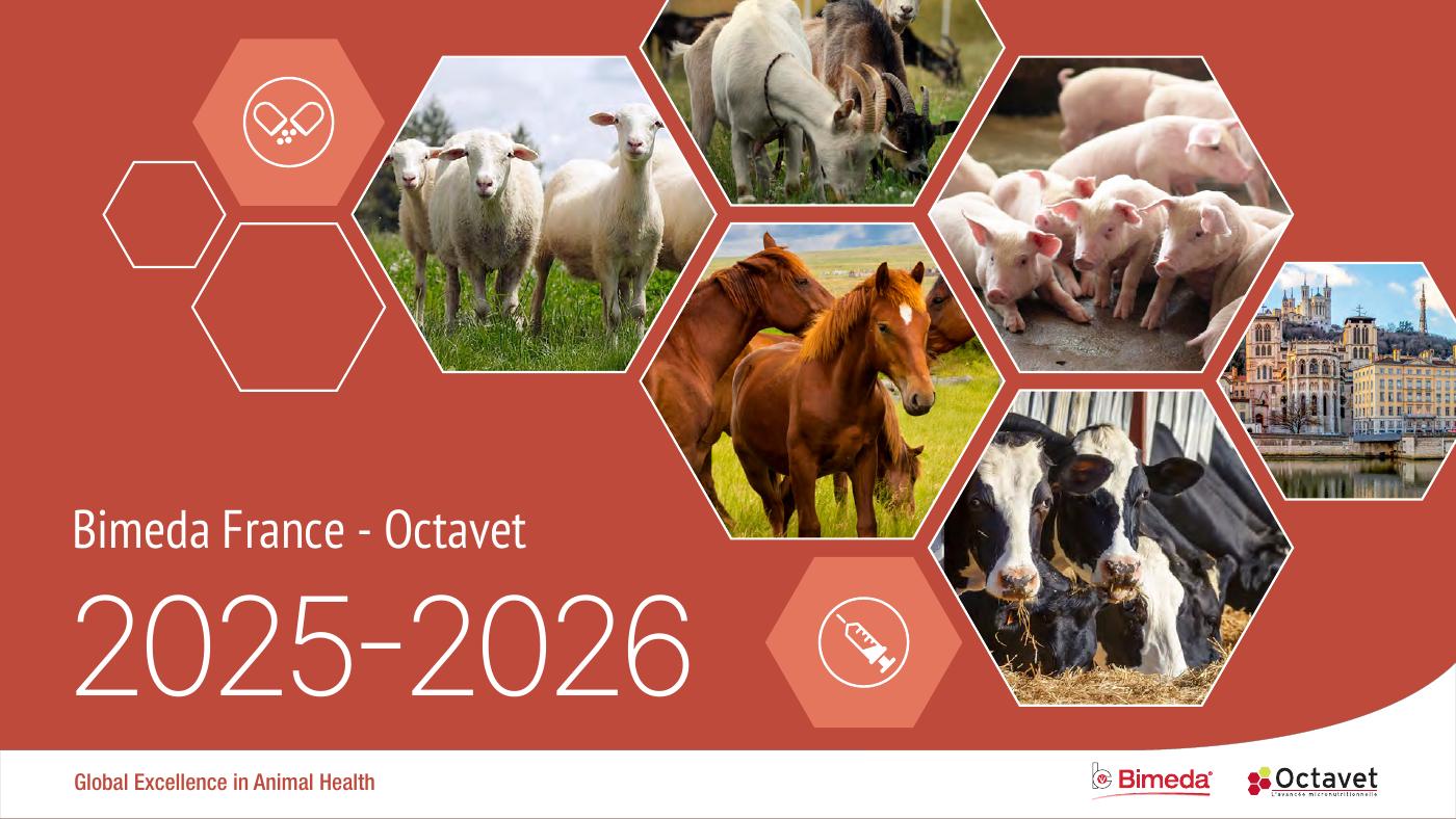

Please note: The return button on detailed product pages does not function in the flipbook preview mode because the platform does not support “go to previous page” command embedded into the PDF. When using the flipbook preview mode, please use your browser’s back button to return to the previous page.
Please note: This interactive catalogue was designed specifically for desktop devices and wide-screen tablets. A mobile version is not available due to layout and usability considerations. For the best experience, please access the catalogue preview using a tablet or desktop computer.

© 2026 Stacey Plakhotnik. All rights reserved.