Scentsation Soap

Labels design for the Soap Boutique

Scentsation Soap

Labels design for the Soap Boutique

Scentsation

Labels design for the Soap Boutique

Project dates: March ‘2016

Customer: The Soap Boutique Co. Ltd.

Project dates: March ‘2016

Customer: The Soap Boutique Co. Ltd.

Project dates: March ‘2016

Customer: The Soap Boutique Co. Ltd.

The brand owner approached me for creating design of her artisan soap labels due to my ability to translate her vision into a modern, cohesive, and visually appealing design that would align with her evolving brand identity. She was seeking a design that not only communicated the quality and craftsmanship behind her soaps but also helped her brand stand out in a competitive market.


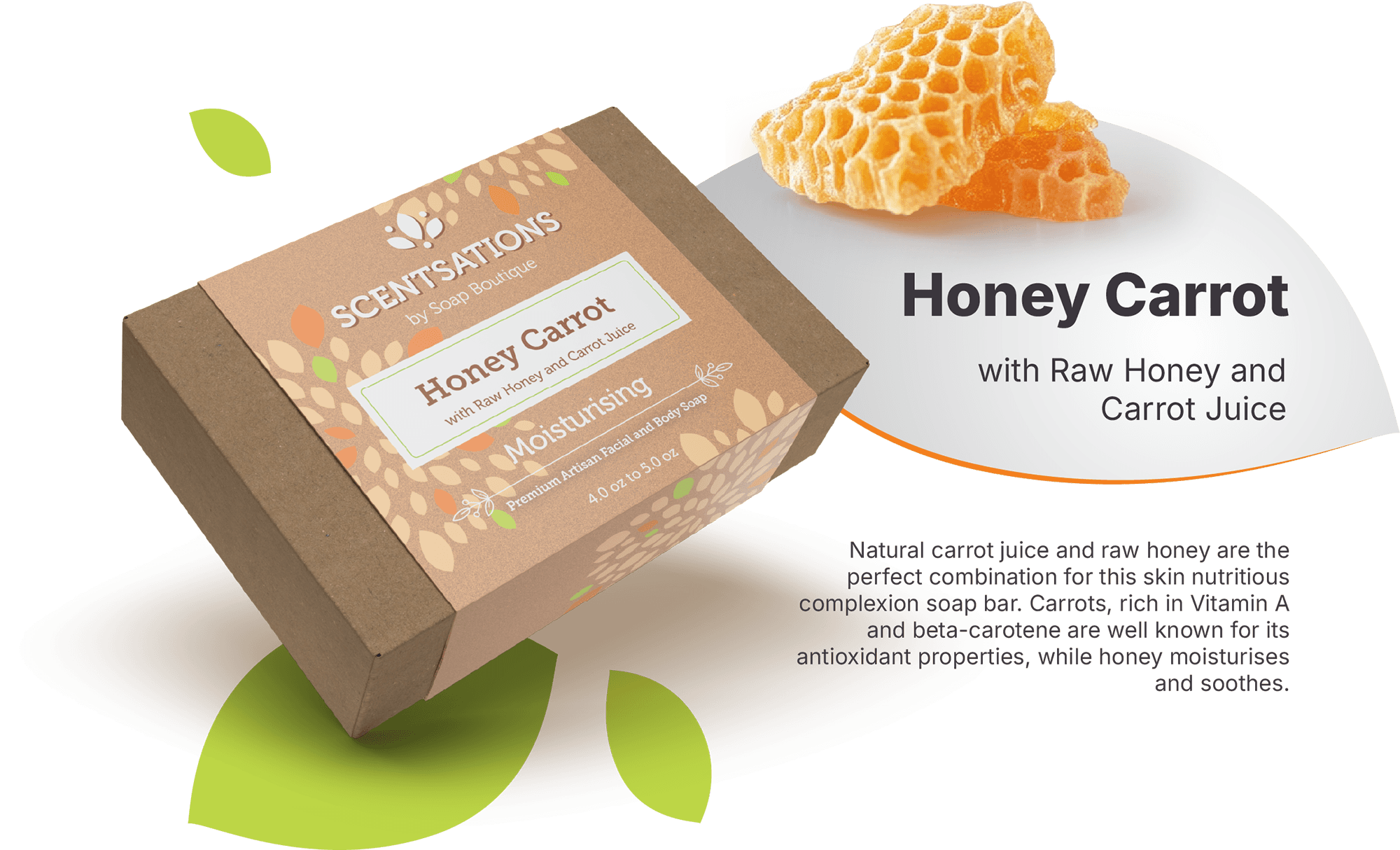
The labels consist of six distinct color variations, each carefully chosen to reflect the unique qualities of the soap while maintaining a cohesive brand identity. While the colors vary, all labels share key structural elements to ensure consistency and recognition across the product line.

The brand owner approached me for creating design of her artisan soap labels due to my ability to translate her vision into a modern, cohesive, and visually appealing design that would align with her evolving brand identity. She was seeking a design that not only communicated the quality and craftsmanship behind her soaps but also helped her brand stand out in a competitive market.


The labels consist of six distinct color variations, each carefully chosen to reflect the unique qualities of the soap while maintaining a cohesive brand identity. While the colors vary, all labels share key structural elements to ensure consistency and recognition across the product line.

key structural components of the label

key structural components of THE LABEL

Product range and labels in action

Product range and labels in action

Each label in this collection is carefully crafted to reflect the essence of its ingredients, ensuring that the design complements the product's unique qualities. For example, Herbal Blossom features a warm green palette, symbolizing the natural freshness of aloe vera, with subtle hints of violet to evoke the calming presence of lavender. Similarly, the De la Mer is dressed in a soothing dusty blue, designed to invoke a sense of relaxation and tranquility, with soft pink accents to highlight the addition of pink salt, enhancing the therapeutic qualities of the soap.


These labels are not just a visual identity; they represent the harmony between nature and self-care, bringing a touch of elegance to every product.

© 2026 Stacey Plakhotnik. All rights reserved.