
Mamaland Coffee
Logotype and package design for the coffee roastery & shop
Mamaland Coffee
Logotype and package design for the coffee roastery & shop
Mamaland Coffee
Logotype and package design for the coffee roastery & shop
Project dates: March ‘2017
Customer: Mamaland Ltd
Project dates: March ‘2017
Customer: Mamaland Ltd
Project dates: March ‘2017
Customer: Mamaland Ltd

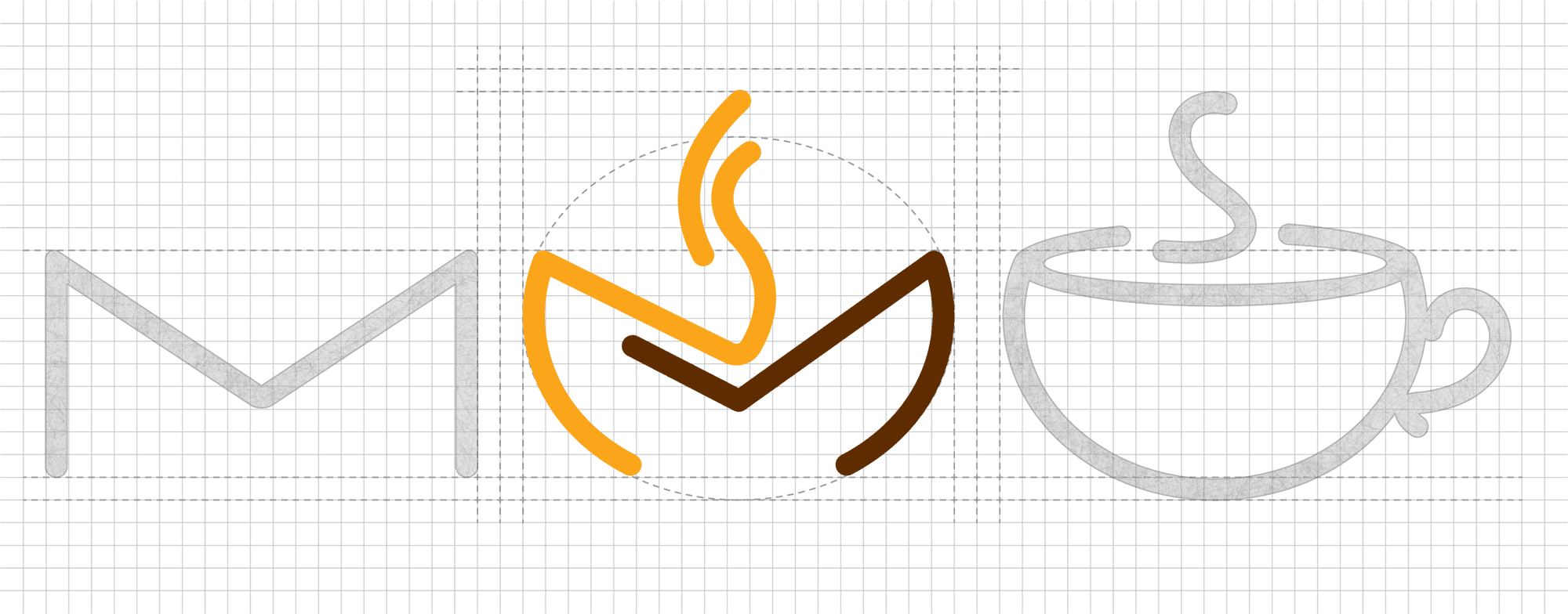

The process of creating this brand mark involves blending two distinct visual elements - the letter "M" and a cup of coffee - into a single, cohesive design. The "M" is modified to form the base of the cup, with its side strokes curving into the cup’s body while the top strokes keep "M" structure. Steam lines are added above to reinforce the coffee theme, using warm colors for contrast. Using a grid ensures balance and symmetry, resulting in a minimalistic logo with smooth curves and clean lines.
The process of creating this brand mark involves blending two distinct visual elements - the letter "M" and a cup of coffee - into a single, cohesive design. The "M" is modified to form the base of the cup, with its side strokes curving into the cup’s body while the top strokes keep "M" structure. Steam lines are added above to reinforce the coffee theme, using warm colors for contrast. Using a grid ensures balance and symmetry, resulting in a minimalistic logo with smooth curves and clean lines.
Brand mark creation process
Brand mark creation process
Light Roast
Light Roast
Light Roast

Pantone 000 C
CMYK 0/0/0/0
FFFFFF
Pantone 000 C
CMYK 0/0/0/0
FFFFFF
Pantone
000 C
CMYK
0/0/0/0
FFFFFF
Medium Roast
Medium Roast
Medium Roast

Pantone 137 C
CMYK 0/40/100/0
FAA61A
Pantone 137 C
CMYK 0/40/100/0
FAA61A
Pantone
137 C
CMYK
0/40/100/0
FAA61A
Dark Roast
Dark Roast
Dark Roast

Pantone 4625 C
CMYK 0/60/100/75
602D00
Pantone 4625 C
CMYK 0/60/100/75
602D00
Pantone
4625 C
CMYK
0/60/100/75
602D00
When selecting the color palette for the three bags, I aimed to create a distinct color-coding system associated with the roast types: white for light roast, brown for dark roast, and warm yellow for medium roast.
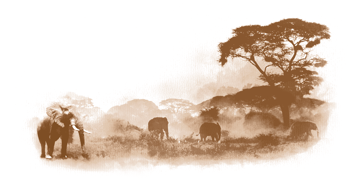
In addition to representing the roast levels, I wanted the colors to reflect the warm, rich hues of a savanna sunset, capturing the essence of Ethiopia’s landscapes and reinforcing the coffee’s origin and heritage.
When selecting the color palette for the three bags, I aimed to create a distinct color-coding system associated with the roast types: white for light roast, brown for dark roast, and warm yellow for medium roast.
In addition to representing the roast levels, I wanted the colors to reflect the warm, rich hues of a savanna sunset, capturing the essence of Ethiopia’s landscapes and reinforcing the coffee’s origin and heritage.
COLOUR Palette (primary swatches)
COLOUR Palette
(primary swatches)


primary typography
Primary Typography
Style

While working on the coffee bag concepts, I aimed to create a neat and elegant design with minimal elements, yet still maintain a highly recognizable coffee appeal. A whole coffee bean pattern was chosen to help customers quickly identify the product and evoke the idea of artisanal craftsmanship. Emphasizing the logotype and product name enhances brand recognition, helping the product stand out and reinforcing its identity. By using minimal elements, the design remains simple and easy to understand, avoiding overcomplicated graphics that could confuse customers.
While working on the coffee bag concepts, I aimed to create a neat and elegant design with minimal elements, yet still maintain a highly recognizable coffee appeal. A whole coffee bean pattern was chosen to help customers quickly identify the product and evoke the idea of artisanal craftsmanship. Emphasizing the logotype and product name enhances brand recognition, helping the product stand out and reinforcing its identity. By using minimal elements, the design remains simple and easy to understand, avoiding overcomplicated graphics that could confuse customers.

Package Design for Three Coffee Roasts
Package Design for Three Coffee Roasts
© 2026 Stacey Plakhotnik. All rights reserved.