
Bimeda Sustainability
Full visual identity for the sustainability project, including logo, slogan, brand color palette, icon set
" width="90px"><path d="M 0 30 L 0 0 L 90 0 L 90 30 Z" fill="transparent" height="30px" id="ZRBL04_SW" width="90px"/><path d="M 0 0 L 90 0 L 47.748 29.212 C 46.233 30.26 43.773 30.26 42.252 29.212 Z" fill="rgb(255, 255, 255)" height="29.997749999999996px" id="TZYYm46Wn" width="90px"/></g></svg>)
Bimeda Sustainability
Full visual identity for the sustainability project, including logo, slogan, brand color palette, icon set
Bimeda Sustainability
Full visual identity for the sustainability project, including logo, slogan, brand colors, icon set
Project dates: February 2022 - September 2022
Customer: Bimeda Animal Health Ltd
Project dates: February 2022 - September 2022
Customer: Bimeda Animal Health Ltd
Project dates: February 2022 - September 2022
Customer: Bimeda Animal Health Ltd

Project Overview
Project Overview
As part of Bimeda’s growing commitment to sustainability, I was asked to lead the visual redesign of brand assets for the company’s new sustainability initiative. Rooted in Bimeda’s values of collaboration, innovation, and continuous improvement, the project aimed to reflect the company’s environmental focus while maintaining brand consistency. The adapted visual identity was developed specifically for sustainability-related communications, complementing - rather than replacing - the core branding.
As part of Bimeda’s growing commitment to sustainability, I was asked to lead the visual redesign of brand assets for the company’s new sustainability initiative. Rooted in Bimeda’s values of collaboration, innovation, and continuous improvement, the project aimed to reflect the company’s environmental focus while maintaining brand consistency. The adapted visual identity was developed specifically for sustainability-related communications, complementing - rather than replacing - the core branding.


Brand Foundation...
Brand Foundation
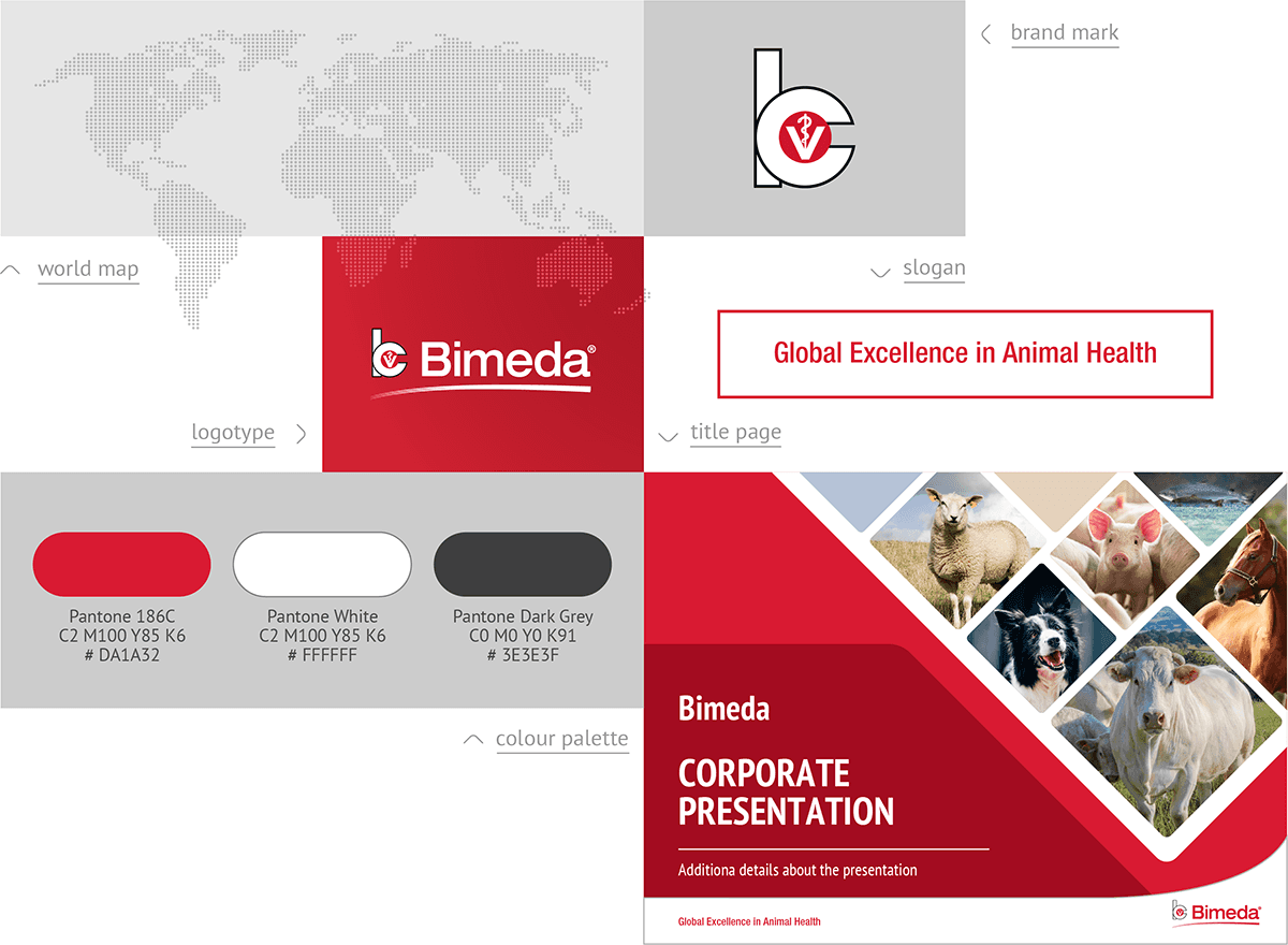
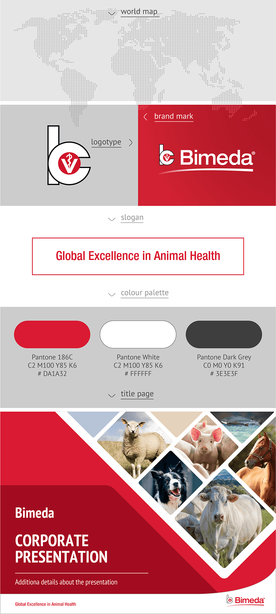
Before starting the redesign, I referred to Bimeda’s existing brand assets, which served as the foundation for the sustainability adaptation. These included the brand mark, logotype, slogan, primary colour palette, and the standard title slide template used across corporate communications. The challenge was to respect and preserve brand recognition while evolving these elements to align with the tone and goals of the sustainability initiative.
Before starting the redesign, I referred to Bimeda’s existing brand assets, which served as the foundation for the sustainability adaptation. These included the brand mark, logotype, slogan, primary colour palette, and the standard title slide template used across corporate communications. The challenge was to respect and preserve brand recognition while evolving these elements to align with the tone and goals of the sustainability initiative.



... Sustainability Adaptation
Sustainability Adaptation
01
01
brand mark
brand mark
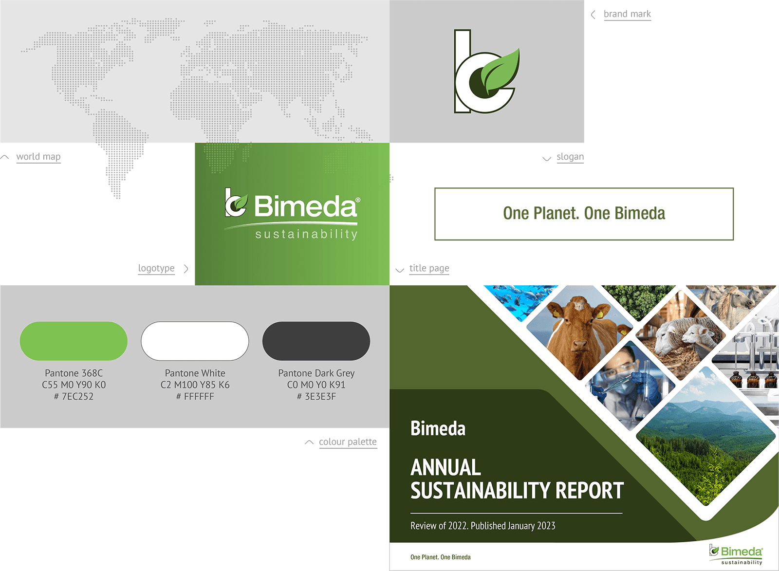
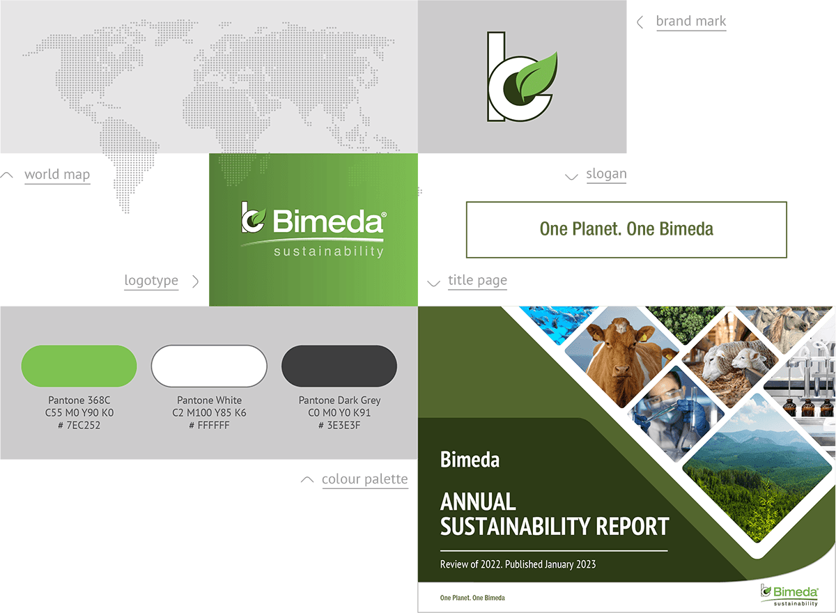
The redesign began with the brand mark, where I aimed to preserve recognisable visual elements while introducing cues that reflect sustainability and care for the environment. I retained the iconic “B” and circular form from the original logo to maintain brand continuity. The red circle was reimagined as a solid black shape, representing depth and grounding, while the Rod of Asclepius - a traditional symbol of medicine - was replaced by a green leaf emerging from the circle. This small but thoughtful update adds an environmental focus without losing the brand’s identity roots.
The redesign began with the brand mark, where I aimed to preserve recognisable visual elements while introducing cues that reflect sustainability and care for the environment. I retained the iconic “B” and circular form from the original logo to maintain brand continuity. The red circle was reimagined as a solid black shape, representing depth and grounding, while the Rod of Asclepius - a traditional symbol of medicine - was replaced by a green leaf emerging from the circle. This small but thoughtful update adds an environmental focus without losing the brand’s identity roots.

" transform="translate(2 2)" width="15.999974999999967px"/></svg>)

" width="32px"><path d="M 29.24 13.31 L 16 0 L 2.76 13.31 C -0.92 17 -0.92 23 2.76 26.69 L 16 40 L 29.24 26.69 C 32.92 23 32.92 17 29.24 13.31 Z" fill="rgb(255, 255, 255)" height="40px" id="J3Kxv4hHZ" width="32px"/><path d="M 0 40 L 13.246 26.69 C 16.918 23 16.918 17.01 13.246 13.31 L 0 0" fill="transparent" height="40px" id="rziuHXyvy" stroke-dasharray="" stroke-linecap="round" stroke-linejoin="miter" stroke-miterlimit="10" stroke-width="2.4" stroke="rgb(179, 179, 179)" transform="translate(16 0)" width="15.999974999999967px"/></g></svg>)

02
02
colours PALETTE
colours PALETTE
The original colour palette centers on Bimeda Red as the primary colour, complemented by white backgrounds and dark grey body text. Supporting tones include warm crimson and deep garnet for gradients and depth. In the sustainability redesign, red was replaced with a fresh, vibrant spring green to symbolize growth and renewal. White and dark grey were retained for clarity and readability, while the supporting shades transitioned to rich olive and deep forest green, reinforcing a natural and eco-friendly aesthetic.
The original colour palette centers on Bimeda Red as the primary colour, complemented by white backgrounds and dark grey body text. Supporting tones include warm crimson and deep garnet for gradients and depth. In the sustainability redesign, red was replaced with a fresh, vibrant spring green to symbolize growth and renewal. White and dark grey were retained for clarity and readability, while the supporting shades transitioned to rich olive and deep forest green, reinforcing a natural and eco-friendly aesthetic.


03
03
Slogan
Slogan
The original slogan, “Global Excellence in Animal Health,” emphasizes Bimeda’s worldwide leadership and commitment to animal wellbeing. For the sustainability initiative, it was adapted to “One Planet. One Bimeda” to highlight shared responsibility and commitment to the environment.
The original slogan, “Global Excellence in Animal Health,” emphasizes Bimeda’s worldwide leadership and commitment to animal wellbeing. For the sustainability initiative, it was adapted to “One Planet. One Bimeda” to highlight shared responsibility and commitment to the environment.



04
04
From Core to Green
From Core to Green
Using the existing brand assets as a starting point, I reimagined each element for sustainability-related communications. The redesigned mark, refreshed colour palette, and new slogan work together to communicate Bimeda’s environmental focus while keeping the brand’s core identity intact. The cover used for presentations and reports was also adapted: the original animal imagery was expanded to a broader range of visuals, including laboratory and manufacturing scenes, green landscapes, and key species such as cattle, sheep, and horses.

Five Drivers of Change
Five Drivers of Change
Five clear pillars were developed to translate Bimeda’s sustainability vision into actionable areas – Waste, Energy, Transport, Packaging, and Community. To support communication across initiatives and teams, I created custom icons and a consistent visual framework, giving structure and clarity to the company’s sustainability priorities.
Five clear pillars were developed to translate Bimeda’s sustainability vision into actionable areas – Waste, Energy, Transport, Packaging, and Community. To support communication across initiatives and teams, I created custom icons and a consistent visual framework, giving structure and clarity to the company’s sustainability priorities.


© 2026 Stacey Plakhotnik. All rights reserved.