
Global Assets Hub
UX and UI design (desktop version) for the new Global Assets Hub
based on SharePoint platform
" width="90px"><path d="M 0 30 L 0 0 L 90 0 L 90 30 Z" fill="transparent" height="30px" id="ZRBL04_SW" width="90px"/><path d="M 0 0 L 90 0 L 47.748 29.212 C 46.233 30.26 43.773 30.26 42.252 29.212 Z" fill="rgb(255, 255, 255)" height="29.997749999999996px" id="TZYYm46Wn" width="90px"/></g></svg>)
Global Assets Hub
UX and UI design (desktop version) for the new Global Assets Hub
Project dates: March 2024 - Present time
Customer: Bimeda Animal Health Ltd
Project dates: March 2024 - Present time
Customer: Bimeda Animal Health Ltd
Project dates: March 2024 - Present time
Customer: Bimeda Animal Health Ltd
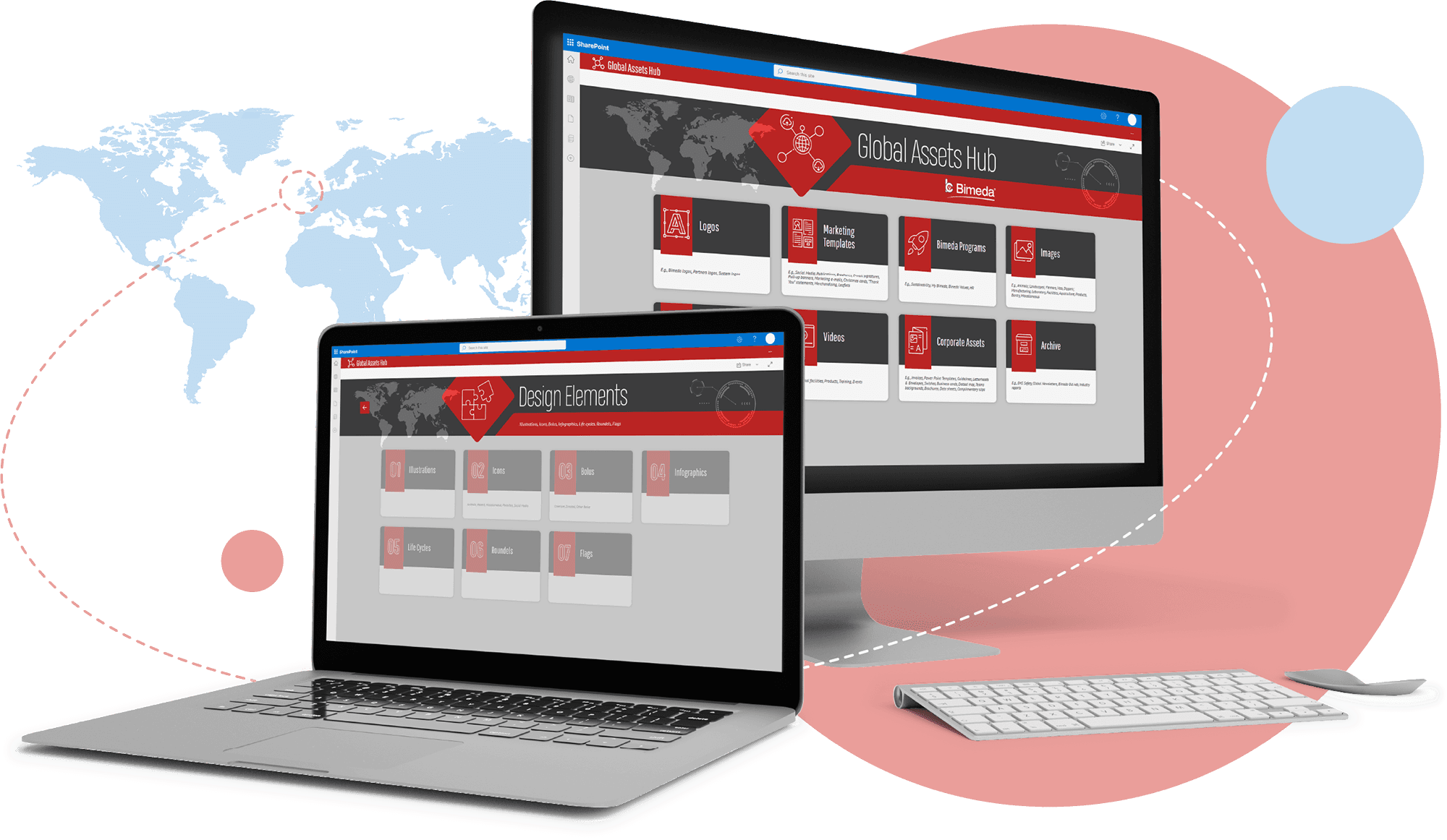
Project Overview
Project Overview
The Global Assets Hub project was initiated to improve the accessibility, organization, and efficiency of the company’s digital asset management system. Our management tasked the artwork department with reworking the existing FTP-based asset storage, as it posed several challenges - some countries could not access the FTP server, while others experienced slow performance. Additionally, the increasing volume of files led to disorganized storage, making it difficult for teams to find and manage assets effectively. To address these issues, we were asked to transition the assets to a new web-based SharePoint server, ensuring a more structured and accessible system.
The Global Assets Hub project was initiated to improve the accessibility, organization, and efficiency of the company’s digital asset management system. Our management tasked the artwork department with reworking the existing FTP-based asset storage, as it posed several challenges - some countries could not access the FTP server, while others experienced slow performance. Additionally, the increasing volume of files led to disorganized storage, making it difficult for teams to find and manage assets effectively. To address these issues, we were asked to transition the assets to a new web-based SharePoint server, ensuring a more structured and accessible system.


As one of the two lead designers on the project, I worked alongside my colleague, with the entire design team contributing at various stages. Our responsibilities included advising the IT department on structuring the new system, designing the initial landing page and folder hierarchy, and overseeing the cleanup of obsolete assets from the corporate hub. We also facilitated the migration of relevant files from the global server while ensuring that proper naming conventions were implemented for consistency. Additionally, we collaborated with IT to define the correct access permissions, ensuring that users had appropriate and secure access to the assets.
This project not only streamlined asset management but also enhanced usability and efficiency across different regions.
As one of the two lead designers on the project, I worked alongside my colleague, with the entire design team contributing at various stages. Our responsibilities included advising the IT department on structuring the new system, designing the initial landing page and folder hierarchy, and overseeing the cleanup of obsolete assets from the corporate hub. We also facilitated the migration of relevant files from the global server while ensuring that proper naming conventions were implemented for consistency. Additionally, we collaborated with IT to define the correct access permissions, ensuring that users had appropriate and secure access to the assets.
This project not only streamlined asset management but also enhanced usability and efficiency across different regions.
Problem Statement
Problem Statement
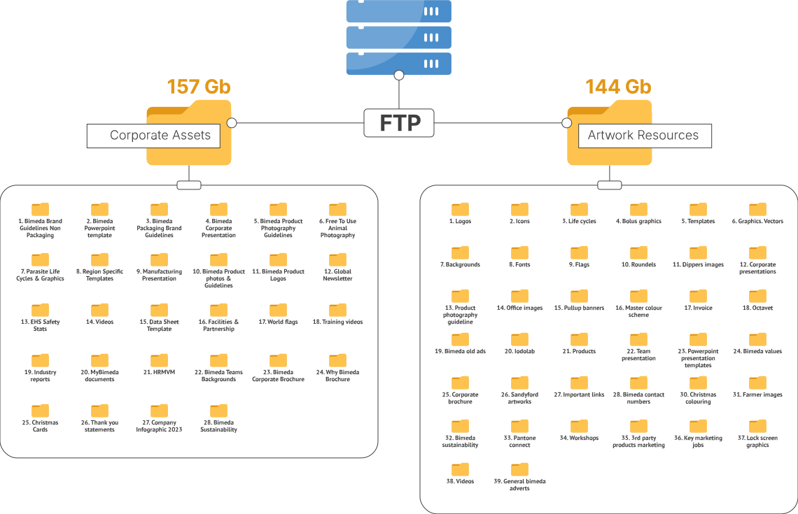
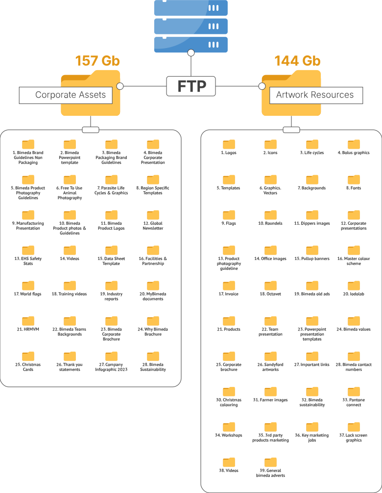
Our existing asset storage system was based on a local FTP server, which presented several challenges. Some countries were unable to access the assets storage, while others experienced extremely slow performance. Additionally, as more files accumulated over time, the organization of assets became increasingly chaotic, making it difficult for teams to find and manage the resources they needed. There were no standardized naming conventions, and obsolete files cluttered the system, further reducing efficiency.
Our existing asset storage system was based on a local FTP server, which presented several challenges. Some countries were unable to access the assets storage, while others experienced extremely slow performance. Additionally, as more files accumulated over time, the organization of assets became increasingly chaotic, making it difficult for teams to find and manage the resources they needed. There were no standardized naming conventions, and obsolete files cluttered the system, further reducing efficiency.
Define objects for grouping
Define objects for grouping
The first task was to define key categories for grouping the assets. To achieve this, we began by compiling a comprehensive list of all existing folder names from the current system. We then identified and removed any obsolete or redundant items to streamline the structure. Once the list was refined, we created an initial rough grouping, establishing a foundational structure for preparing the objects for collaborative analysis using an affinity diagram
The first task was to define key categories for grouping the assets. To achieve this, we began by compiling a comprehensive list of all existing folder names from the current system. We then identified and removed any obsolete or redundant items to streamline the structure. Once the list was refined, we created an initial rough grouping, establishing a foundational structure for preparing the objects for collaborative analysis using an affinity diagram

Stacey and her colleague D.B. are working on compiling a list of all existing folder names, removing any obsolete or redundant items
Stacey and her colleague D.B. are working on compiling a list of all existing folder names, removing any obsolete or redundant items
Stacey and her colleague D.B. are working on compiling a list of all existing folder names, removing any obsolete items

" width="69.30692998300687px"><path d="M 28.385 20.958 L 8.66 1.47 C 6.678 -0.49 3.469 -0.49 1.487 1.47 C -0.496 3.43 -0.496 6.601 1.487 8.554 L 17.621 24.5 L 1.487 40.446 C -0.496 42.406 -0.496 45.577 1.487 47.53 C 2.478 48.51 3.774 49 5.07 49 C 6.366 49 7.662 48.51 8.653 47.53 L 28.378 28.042 C 30.36 26.082 30.36 22.911 28.378 20.958 Z" fill="rgb(254, 195, 78)" height="49px" id="pyMo4Nc8R" transform="translate(39.443 0)" width="29.864356435643586px"/><path d="M 28.378 20.958 L 8.66 1.47 C 6.678 -0.49 3.469 -0.49 1.487 1.47 C -0.496 3.43 -0.496 6.601 1.487 8.554 L 17.621 24.5 L 1.487 40.446 C -0.496 42.406 -0.496 45.577 1.487 47.53 C 2.478 48.51 3.774 49 5.07 49 C 6.366 49 7.662 48.51 8.653 47.53 L 28.378 28.042 C 30.36 26.082 30.36 22.911 28.378 20.958 Z" fill="rgb(254, 195, 78)" height="49px" id="AJoOZPFB1" transform="translate(19.725 0)" width="29.864356435643565px"/><path d="M 28.385 20.958 L 8.66 1.47 C 6.678 -0.49 3.469 -0.49 1.487 1.47 C -0.496 3.43 -0.496 6.601 1.487 8.554 L 17.621 24.5 L 1.487 40.446 C -0.496 42.406 -0.496 45.577 1.487 47.53 C 2.478 48.51 3.774 49 5.07 49 C 6.366 49 7.662 48.51 8.653 47.53 L 28.378 28.042 C 30.36 26.082 30.36 22.911 28.378 20.958 Z" fill="rgb(254, 195, 78)" height="49px" id="Ldo_QyI_r" transform="translate(0 0)" width="29.86435903465345px"/></g><g opacity="0.3"><g d="M 17.628 24.5 L 10.448 31.591 C 14.794 32.298 19.416 32.501 24.192 32.186 L 28.385 28.042 C 30.367 26.082 30.367 22.911 28.385 20.958 L 8.66 1.47 C 6.678 -0.49 3.469 -0.49 1.487 1.47 C -0.496 3.43 -0.496 6.601 1.487 8.554 L 17.621 24.5 Z M 37.346 24.5 L 30.242 31.521 C 36.528 30.548 42.988 28.7 49.378 25.935 C 49.891 24.227 49.468 22.309 48.102 20.965 L 28.385 1.47 C 26.402 -0.49 23.194 -0.49 21.211 1.47 C 19.229 3.43 19.229 6.601 21.211 8.554 Z M 55.511 22.96 C 58.63 21.294 61.569 19.467 64.327 17.5 L 48.102 1.47 C 46.12 -0.49 42.911 -0.49 40.929 1.47 C 38.947 3.43 38.947 6.601 40.929 8.554 Z" fill="transparent" height="32.33006151844895px" id="EzFxRUGVH" transform="translate(1.036 0)" width="64.32723082740709px"><path d="M 17.628 24.5 L 10.448 31.591 C 14.794 32.298 19.416 32.501 24.192 32.186 L 28.385 28.042 C 30.367 26.082 30.367 22.911 28.385 20.958 L 8.66 1.47 C 6.678 -0.49 3.469 -0.49 1.487 1.47 C -0.496 3.43 -0.496 6.601 1.487 8.554 L 17.621 24.5 Z" fill="rgb(255, 255, 255)" height="32.33006151844895px" id="l3tZf2lf6" transform="translate(0 0)" width="29.871289727722782px"/><path d="M 17.621 24.5 L 10.517 31.521 C 16.803 30.548 23.263 28.7 29.653 25.935 C 30.166 24.227 29.743 22.309 28.378 20.965 L 8.66 1.47 C 6.678 -0.49 3.469 -0.49 1.487 1.47 C -0.496 3.43 -0.496 6.601 1.487 8.554 Z" fill="rgb(255, 255, 255)" height="31.52099999999966px" id="qp9i6XIJc" transform="translate(19.725 0)" width="29.863674912829055px"/><path d="M 16.069 22.96 C 19.188 21.294 22.126 19.467 24.885 17.5 L 8.66 1.47 C 6.678 -0.49 3.469 -0.49 1.487 1.47 C -0.496 3.43 -0.496 6.601 1.487 8.554 Z" fill="rgb(255, 255, 255)" height="22.959999999999965px" id="T7OA0xoar" transform="translate(39.443 0)" width="24.884653465346542px"/></g></g></svg>)

collaborative analysis to group objects
collaborative analysis to group objects
After defining the key objects, the next step was to organize them into a clear and logical structure. To achieve this, I proposed using the affinity diagram method, which would allow us to visually group related items and identify patterns. I invited my colleagues to participate in a collaborative session, ensuring that we considered different viewpoints to create a clear and balanced categorization.
During the two-hour session, we systematically analyzed and grouped the objects, aiming to form 7-8 distinct categories that would provide a strong foundation for the final structure. The process involved discussion, realignment, and refinement as we worked together to ensure that each group made sense within the broader system. By the end of the session, we successfully established our first structured dataset, setting the stage for the next phase of the project.
After defining the key objects, the next step was to organize them into a clear and logical structure. To achieve this, I proposed using the affinity diagram method, which would allow us to visually group related items and identify patterns. I invited my colleagues to participate in a collaborative session, ensuring that we considered different viewpoints to create a clear and balanced categorization.
During the two-hour session, we systematically analyzed and grouped the objects, aiming to form 7-8 distinct categories that would provide a strong foundation for the final structure. The process involved discussion, realignment, and refinement as we worked together to ensure that each group made sense within the broader system. By the end of the session, we successfully established our first structured dataset, setting the stage for the next phase of the project.

Stacey and her colleagues are running the affinity diagram session
Stacey and her colleagues are running the affinity diagram session
Stacey and her colleagues are running the affinity diagram session
" width="69.30692998300687px"><path d="M 28.385 20.958 L 8.66 1.47 C 6.678 -0.49 3.469 -0.49 1.487 1.47 C -0.496 3.43 -0.496 6.601 1.487 8.554 L 17.621 24.5 L 1.487 40.446 C -0.496 42.406 -0.496 45.577 1.487 47.53 C 2.478 48.51 3.774 49 5.07 49 C 6.366 49 7.662 48.51 8.653 47.53 L 28.378 28.042 C 30.36 26.082 30.36 22.911 28.378 20.958 Z" fill="rgb(233, 158, 154)" height="49px" id="eCjLFBsKA" transform="translate(39.443 0)" width="29.864356435643586px"/><path d="M 28.378 20.958 L 8.66 1.47 C 6.678 -0.49 3.469 -0.49 1.487 1.47 C -0.496 3.43 -0.496 6.601 1.487 8.554 L 17.621 24.5 L 1.487 40.446 C -0.496 42.406 -0.496 45.577 1.487 47.53 C 2.478 48.51 3.774 49 5.07 49 C 6.366 49 7.662 48.51 8.653 47.53 L 28.378 28.042 C 30.36 26.082 30.36 22.911 28.378 20.958 Z" fill="rgb(233, 158, 154)" height="49px" id="K2GlcK9Iy" transform="translate(19.725 0)" width="29.864356435643565px"/><path d="M 28.385 20.958 L 8.66 1.47 C 6.678 -0.49 3.469 -0.49 1.487 1.47 C -0.496 3.43 -0.496 6.601 1.487 8.554 L 17.621 24.5 L 1.487 40.446 C -0.496 42.406 -0.496 45.577 1.487 47.53 C 2.478 48.51 3.774 49 5.07 49 C 6.366 49 7.662 48.51 8.653 47.53 L 28.378 28.042 C 30.36 26.082 30.36 22.911 28.378 20.958 Z" fill="rgb(233, 158, 154)" height="49px" id="A6NljU8BI" transform="translate(0 0)" width="29.86435903465345px"/></g><g opacity="0.3"><g d="M 17.628 24.5 L 10.448 31.591 C 14.794 32.298 19.416 32.501 24.192 32.186 L 28.385 28.042 C 30.367 26.082 30.367 22.911 28.385 20.958 L 8.66 1.47 C 6.678 -0.49 3.469 -0.49 1.487 1.47 C -0.496 3.43 -0.496 6.601 1.487 8.554 L 17.621 24.5 Z M 37.346 24.5 L 30.242 31.521 C 36.528 30.548 42.988 28.7 49.378 25.935 C 49.891 24.227 49.468 22.309 48.102 20.965 L 28.385 1.47 C 26.402 -0.49 23.194 -0.49 21.211 1.47 C 19.229 3.43 19.229 6.601 21.211 8.554 Z M 55.511 22.96 C 58.63 21.294 61.569 19.467 64.327 17.5 L 48.102 1.47 C 46.12 -0.49 42.911 -0.49 40.929 1.47 C 38.947 3.43 38.947 6.601 40.929 8.554 Z" fill="transparent" height="32.33006151844895px" id="R3wgRY2NC" transform="translate(1.036 0)" width="64.32723082740709px"><path d="M 17.628 24.5 L 10.448 31.591 C 14.794 32.298 19.416 32.501 24.192 32.186 L 28.385 28.042 C 30.367 26.082 30.367 22.911 28.385 20.958 L 8.66 1.47 C 6.678 -0.49 3.469 -0.49 1.487 1.47 C -0.496 3.43 -0.496 6.601 1.487 8.554 L 17.621 24.5 Z" fill="rgb(255, 255, 255)" height="32.33006151844895px" id="ACNpvRt7E" transform="translate(0 0)" width="29.871289727722782px"/><path d="M 17.621 24.5 L 10.517 31.521 C 16.803 30.548 23.263 28.7 29.653 25.935 C 30.166 24.227 29.743 22.309 28.378 20.965 L 8.66 1.47 C 6.678 -0.49 3.469 -0.49 1.487 1.47 C -0.496 3.43 -0.496 6.601 1.487 8.554 Z" fill="rgb(255, 255, 255)" height="31.52099999999966px" id="qpcsIYgMG" transform="translate(19.725 0)" width="29.863674912829055px"/><path d="M 16.069 22.96 C 19.188 21.294 22.126 19.467 24.885 17.5 L 8.66 1.47 C 6.678 -0.49 3.469 -0.49 1.487 1.47 C -0.496 3.43 -0.496 6.601 1.487 8.554 Z" fill="rgb(255, 255, 255)" height="22.959999999999965px" id="NHaU_IVBm" transform="translate(39.443 0)" width="24.884653465346542px"/></g></g></svg>)

Approving the structure with stakeholders
Approving the structure
with stakeholders
After finalizing the initial structure from our affinity diagram session, we shared it with stakeholders to gather their input and ensure it met their needs. Their feedback was crucial in refining the categorization and making necessary adjustments.
Through a series of Teams meetings and email discussions, we addressed their suggestions and fine-tuned the structure. After several iterations, we reached a version that was clear, functional, and aligned with everyone's expectations. With all stakeholders in agreement, we had a polished and approved structure, ready for implementation.
After finalizing the initial structure from our affinity diagram session, we shared it with stakeholders to gather their input and ensure it met their needs. Their feedback was crucial in refining the categorization and making necessary adjustments.
Through a series of Teams meetings and email discussions, we addressed their suggestions and fine-tuned the structure. After several iterations, we reached a version that was clear, functional, and aligned with everyone's expectations. With all stakeholders in agreement, we had a polished and approved structure, ready for implementation.
" width="69.30692998300687px"><path d="M 28.385 20.958 L 8.66 1.47 C 6.678 -0.49 3.469 -0.49 1.487 1.47 C -0.496 3.43 -0.496 6.601 1.487 8.554 L 17.621 24.5 L 1.487 40.446 C -0.496 42.406 -0.496 45.577 1.487 47.53 C 2.478 48.51 3.774 49 5.07 49 C 6.366 49 7.662 48.51 8.653 47.53 L 28.378 28.042 C 30.36 26.082 30.36 22.911 28.378 20.958 Z" fill="rgb(119, 171, 217)" height="49px" id="XCExXSzDn" transform="translate(39.443 0)" width="29.864356435643586px"/><path d="M 28.378 20.958 L 8.66 1.47 C 6.678 -0.49 3.469 -0.49 1.487 1.47 C -0.496 3.43 -0.496 6.601 1.487 8.554 L 17.621 24.5 L 1.487 40.446 C -0.496 42.406 -0.496 45.577 1.487 47.53 C 2.478 48.51 3.774 49 5.07 49 C 6.366 49 7.662 48.51 8.653 47.53 L 28.378 28.042 C 30.36 26.082 30.36 22.911 28.378 20.958 Z" fill="rgb(119, 171, 217)" height="49px" id="L0jHwy9I4" transform="translate(19.725 0)" width="29.864356435643565px"/><path d="M 28.385 20.958 L 8.66 1.47 C 6.678 -0.49 3.469 -0.49 1.487 1.47 C -0.496 3.43 -0.496 6.601 1.487 8.554 L 17.621 24.5 L 1.487 40.446 C -0.496 42.406 -0.496 45.577 1.487 47.53 C 2.478 48.51 3.774 49 5.07 49 C 6.366 49 7.662 48.51 8.653 47.53 L 28.378 28.042 C 30.36 26.082 30.36 22.911 28.378 20.958 Z" fill="rgb(119, 171, 217)" height="49px" id="QK25nIvsX" transform="translate(0 0)" width="29.86435903465345px"/></g><g opacity="0.3"><g d="M 17.628 24.5 L 10.448 31.591 C 14.794 32.298 19.416 32.501 24.192 32.186 L 28.385 28.042 C 30.367 26.082 30.367 22.911 28.385 20.958 L 8.66 1.47 C 6.678 -0.49 3.469 -0.49 1.487 1.47 C -0.496 3.43 -0.496 6.601 1.487 8.554 L 17.621 24.5 Z M 37.346 24.5 L 30.242 31.521 C 36.528 30.548 42.988 28.7 49.378 25.935 C 49.891 24.227 49.468 22.309 48.102 20.965 L 28.385 1.47 C 26.402 -0.49 23.194 -0.49 21.211 1.47 C 19.229 3.43 19.229 6.601 21.211 8.554 Z M 55.511 22.96 C 58.63 21.294 61.569 19.467 64.327 17.5 L 48.102 1.47 C 46.12 -0.49 42.911 -0.49 40.929 1.47 C 38.947 3.43 38.947 6.601 40.929 8.554 Z" fill="transparent" height="32.33006151844895px" id="dErHT_RGq" transform="translate(1.036 0)" width="64.32723082740709px"><path d="M 17.628 24.5 L 10.448 31.591 C 14.794 32.298 19.416 32.501 24.192 32.186 L 28.385 28.042 C 30.367 26.082 30.367 22.911 28.385 20.958 L 8.66 1.47 C 6.678 -0.49 3.469 -0.49 1.487 1.47 C -0.496 3.43 -0.496 6.601 1.487 8.554 L 17.621 24.5 Z" fill="rgb(255, 255, 255)" height="32.33006151844895px" id="wV4mhhJyB" transform="translate(0 0)" width="29.871289727722782px"/><path d="M 17.621 24.5 L 10.517 31.521 C 16.803 30.548 23.263 28.7 29.653 25.935 C 30.166 24.227 29.743 22.309 28.378 20.965 L 8.66 1.47 C 6.678 -0.49 3.469 -0.49 1.487 1.47 C -0.496 3.43 -0.496 6.601 1.487 8.554 Z" fill="rgb(255, 255, 255)" height="31.52099999999966px" id="QYYOr9yOr" transform="translate(19.725 0)" width="29.863674912829055px"/><path d="M 16.069 22.96 C 19.188 21.294 22.126 19.467 24.885 17.5 L 8.66 1.47 C 6.678 -0.49 3.469 -0.49 1.487 1.47 C -0.496 3.43 -0.496 6.601 1.487 8.554 Z" fill="rgb(255, 255, 255)" height="22.959999999999965px" id="RcfAB6_g5" transform="translate(39.443 0)" width="24.884653465346542px"/></g></g></svg>)

Wireframing the Global Assets Hub
Wireframing the Global Assets Hub
With the approved structure and defined categories, the next step was to design the interface for the Global Assets Hub. As the lead designer for this phase, I was responsible for creating the first draft of the interface, ensuring that the layout effectively reflected the newly organized system.
Since the hub was intended for use primarily on laptops and desktops, the focus was on creation of a desktop-friendly design, without mobile optimization at this stage. I carefully translated the structured categories and subcategories into an intuitive and user-friendly interface, aiming for clarity, ease of navigation, and accessibility. This initial wireframe served as the foundation for further refinement and stakeholder review.
With the approved structure and defined categories, the next step was to design the interface for the Global Assets Hub. As the lead designer for this phase, I was responsible for creating the first draft of the interface, ensuring that the layout effectively reflected the newly organized system.
Since the hub was intended for use primarily on laptops and desktops, the focus was on creation of a desktop-friendly design, without mobile optimization at this stage. I carefully translated the structured categories and subcategories into an intuitive and user-friendly interface, aiming for clarity, ease of navigation, and accessibility. This initial wireframe served as the foundation for further refinement and stakeholder review.
Hierarchical structure
Hierarchical structure
Hierarchical structure
Homepage (Top level)
Homepage (Top level)
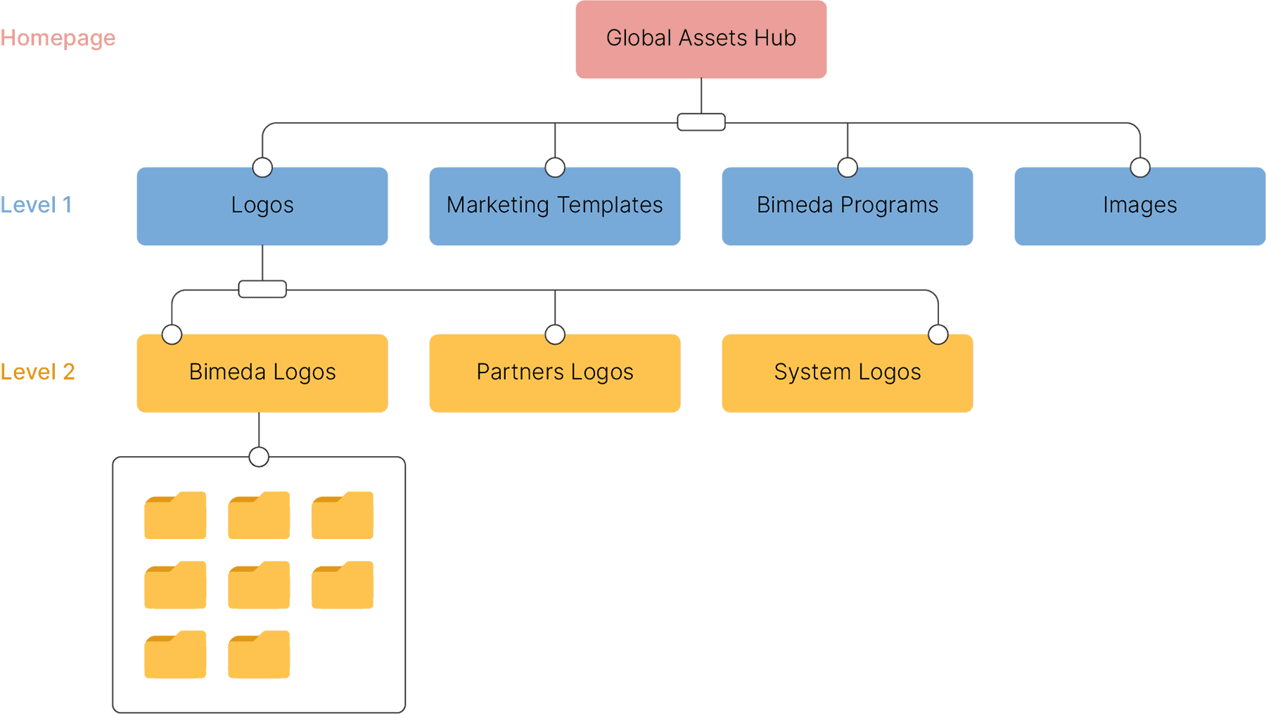
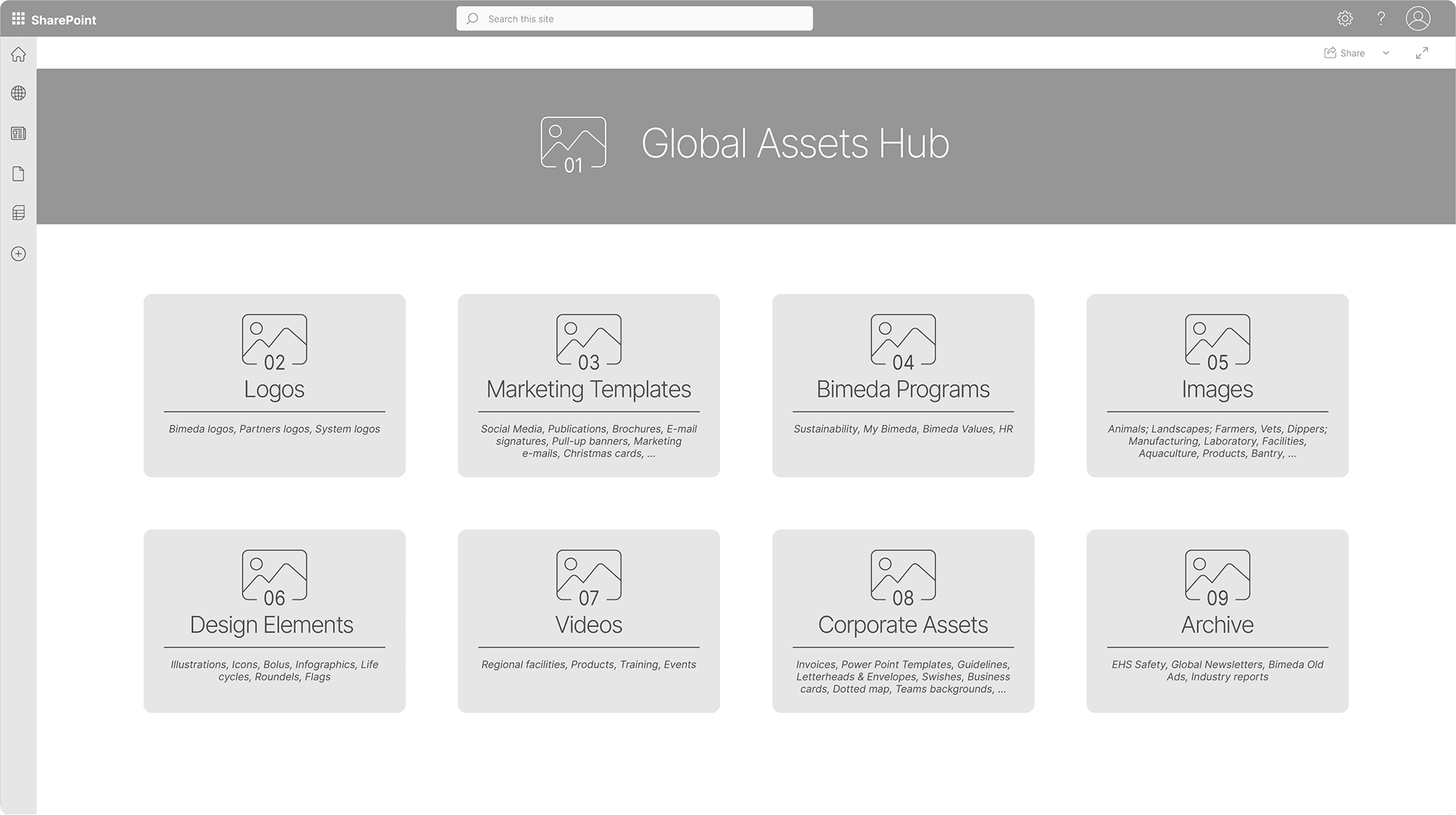
The homepage acts as the main entry point to the Global Assets Hub, providing users with a clear and structured overview of the available asset categories. Each category is represented by a visually distinct card, making navigation intuitive and ensuring quick access to relevant resources.
To enhance clarity and usability, I planned to design custom icons for each card, ensuring that every asset group had a unique, visually distinct representation. Additionally, I decided to include a short overview of the content on each card so users could get a better understanding of what’s inside before clicking through.
The homepage acts as the main entry point to the Global Assets Hub, providing users with a clear and structured overview of the available asset categories. Each category is represented by a visually distinct card, making navigation intuitive and ensuring quick access to relevant resources.
To enhance clarity and usability, I planned to design custom icons for each card, ensuring that every asset group had a unique, visually distinct representation. Additionally, I decided to include a short overview of the content on each card so users could get a better understanding of what’s inside before clicking through.
Level 1
Level 1
At this level, each category page presents a focused view of its sub-sections.
The header features the category’s name and icon, along with a full content overview to help users confirm their location within the Hub. Subcategories are displayed as uniform cards, each labeled with a number (e.g., 01, 02, 03) and a short description, maintaining consistency while offering users quick insight into the content within each section.
I intentionally chose not to use icons at this level to avoid overwhelming users with too many visual elements, reserving unique icons exclusively for top-level categories to reinforce orientation and clarity.
At this level, each category page presents a focused view of its sub-sections.
The header features the category’s name and icon, along with a full content overview to help users confirm their location within the Hub. Subcategories are displayed as uniform cards, each labeled with a number (e.g., 01, 02, 03) and a short description, maintaining consistency while offering users quick insight into the content within each section.
I intentionally chose not to use icons at this level to avoid overwhelming users with too many visual elements, reserving unique icons exclusively for top-level categories to reinforce orientation and clarity.

Level 2
Level 2
This level consists of individual subcategory pages, where users can explore specific assets in more detail. Each page includes a clear header featuring the current category icon and the subcategory name, along with a concise summary of the content. Resources are presented in a clean, list-based format or grouped visually depending on their type, ensuring that users can quickly locate, preview, or download the needed materials without unnecessary steps.
This level consists of individual subcategory pages, where users can explore specific assets in more detail. Each page includes a clear header featuring the current category icon and the subcategory name, along with a concise summary of the content. Resources are presented in a clean, list-based format or grouped visually depending on their type, ensuring that users can quickly locate, preview, or download the needed materials without unnecessary steps.

" height="60px" id="oQ8yjuJmx" transform="translate(0.41 0.01)" width="159.0000092135465px"/></svg>)
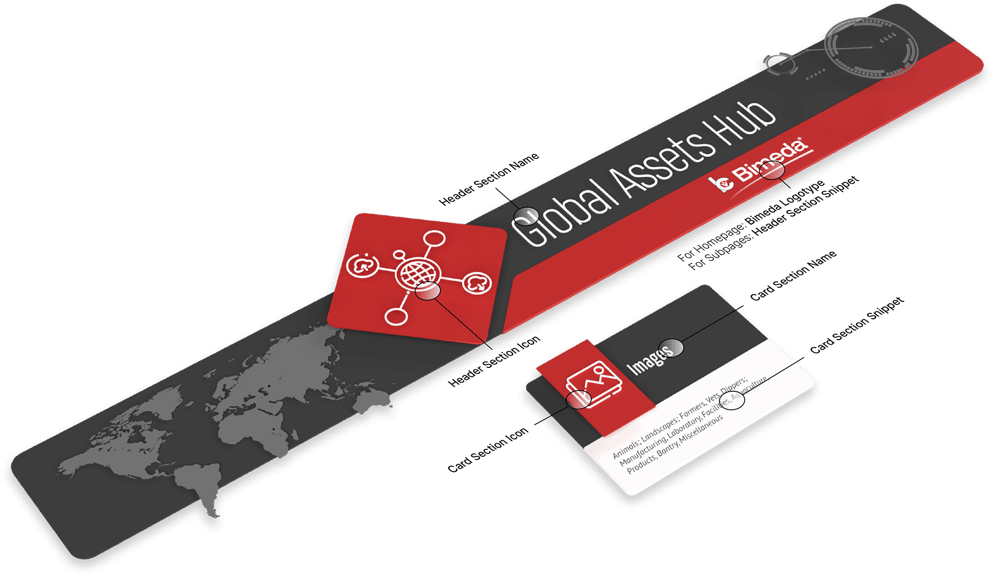
To bring the structure to life, I developed the first UI concepts that visually translated the hierarchy and logic of the Global Assets Hub. The interface design emphasized clarity, consistency, and brand alignment, using Bimeda’s color palette and visual language throughout.
To bring the structure to life, I developed the first UI concepts that visually translated the hierarchy and logic of the Global Assets Hub. The interface design emphasized clarity, consistency, and brand alignment, using Bimeda’s color palette and visual language throughout.

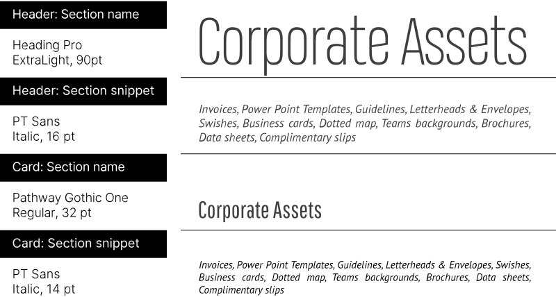
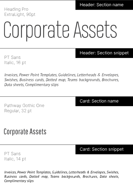
Special attention was given to typography and iconography to maintain visual balance. I used two different but visually similar fonts for the category names in headers and on cards - each chosen for its bold weight options to ensure consistent line thickness across the layout. Likewise, I adapted each category icon for use at different scales: icons on headers were enlarged but refined to retain the same stroke thickness as their smaller card versions. These details contributed to a clean, cohesive look that felt both structured and approachable.
Special attention was given to typography and iconography to maintain visual balance. I used two different but visually similar fonts for the category names in headers and on cards - each chosen for its bold weight options to ensure consistent line thickness across the layout. Likewise, I adapted each category icon for use at different scales: icons on headers were enlarged but refined to retain the same stroke thickness as their smaller card versions. These details contributed to a clean, cohesive look that felt both structured and approachable.
" height="60px" id="unYhcgjDK" transform="translate(0 -0.09)" width="394.0000106611483px"/></svg>)
" height="60px" id="Lqt_JM91u" transform="translate(0.17 0)" width="150.82952421095297px"/></svg>)

" height="60px" id="KWqREMuhI" transform="translate(-0.535 0.398)" width="29.224585765534243px"/><path d="M 0 15.967 C 0 13.698 0.227 11.594 0.691 9.654 C 1.155 7.715 1.939 6.034 3.064 4.6 C 4.188 3.177 5.684 2.053 7.561 1.227 C 9.439 0.413 11.791 0 14.628 0 C 17.465 0 19.817 0.413 21.715 1.227 C 23.603 2.042 25.098 3.167 26.212 4.6 C 27.327 6.034 28.111 7.715 28.564 9.675 C 29.018 11.635 29.256 13.729 29.256 15.967 L 29.256 43.981 C 29.256 46.251 29.029 48.355 28.564 50.294 C 28.1 52.233 27.316 53.914 26.212 55.348 C 25.098 56.782 23.603 57.896 21.715 58.721 C 19.827 59.546 17.465 59.948 14.628 59.948 C 11.791 59.948 9.439 59.536 7.541 58.721 C 5.643 57.906 4.157 56.782 3.043 55.348 C 1.929 53.925 1.145 52.233 0.691 50.273 C 0.237 48.314 0 46.209 0 43.94 L 0 15.957 Z M 14.617 49.386 C 14.617 49.386 14.659 49.386 14.679 49.407 C 14.69 49.417 14.721 49.428 14.772 49.428 C 15.567 49.407 16.196 49.221 16.67 48.891 C 17.145 48.561 17.506 48.128 17.764 47.612 C 18.022 47.096 18.187 46.509 18.28 45.869 C 18.372 45.229 18.414 44.611 18.414 43.992 L 18.414 15.977 C 18.414 15.369 18.372 14.74 18.3 14.1 C 18.228 13.461 18.053 12.883 17.784 12.357 C 17.516 11.831 17.135 11.408 16.639 11.078 C 16.144 10.748 15.474 10.583 14.628 10.583 C 14.556 10.583 14.504 10.572 14.473 10.542 C 13.679 10.572 13.049 10.748 12.575 11.078 C 12.1 11.408 11.739 11.841 11.481 12.357 C 11.224 12.873 11.059 13.45 10.986 14.079 C 10.914 14.709 10.873 15.338 10.873 15.977 L 10.873 43.961 C 10.873 44.569 10.914 45.209 10.986 45.859 C 11.059 46.509 11.234 47.096 11.481 47.622 C 11.729 48.149 12.111 48.571 12.606 48.901 C 13.101 49.232 13.772 49.397 14.617 49.397 Z" fill="rgb(224, 224, 224)" height="59.94843010393552px" id="NpbXTe4W9" transform="translate(33.022 0.439)" width="29.25555373885254px"/><path d="M 0 58.257 L 0 0 L 10.832 0 L 10.832 47.849 L 24.995 47.849 L 24.995 58.257 Z" fill="rgb(224, 224, 224)" height="58.25684013007191px" id="tsSvVm1gt" transform="translate(68.013 1.285)" width="24.995136357275726px"/><path d="M 0 15.967 C 0 13.698 0.227 11.594 0.691 9.654 C 1.155 7.715 1.939 6.034 3.064 4.6 C 4.188 3.177 5.684 2.053 7.561 1.227 C 9.439 0.413 11.791 0 14.628 0 C 17.465 0 19.827 0.413 21.715 1.227 C 23.603 2.042 25.109 3.167 26.212 4.6 C 27.327 6.034 28.111 7.715 28.564 9.675 C 29.018 11.635 29.256 13.729 29.256 15.967 L 29.256 43.981 C 29.256 46.251 29.029 48.355 28.564 50.294 C 28.1 52.233 27.316 53.914 26.212 55.348 C 25.098 56.782 23.603 57.896 21.715 58.721 C 19.827 59.546 17.465 59.948 14.628 59.948 C 11.791 59.948 9.429 59.536 7.541 58.721 C 5.653 57.906 4.157 56.782 3.043 55.348 C 1.929 53.925 1.145 52.233 0.691 50.273 C 0.237 48.314 0 46.209 0 43.94 L 0 15.957 Z M 14.628 49.386 C 14.628 49.386 14.669 49.386 14.69 49.407 C 14.7 49.417 14.731 49.428 14.783 49.428 C 15.577 49.407 16.206 49.221 16.681 48.891 C 17.155 48.561 17.516 48.128 17.774 47.612 C 18.032 47.096 18.197 46.509 18.29 45.869 C 18.383 45.229 18.424 44.611 18.424 43.992 L 18.424 15.977 C 18.424 15.369 18.383 14.74 18.311 14.1 C 18.238 13.461 18.063 12.883 17.795 12.357 C 17.527 11.831 17.145 11.408 16.65 11.078 C 16.155 10.748 15.484 10.583 14.638 10.583 C 14.566 10.583 14.514 10.572 14.483 10.542 C 13.689 10.572 13.06 10.748 12.585 11.078 C 12.111 11.408 11.75 11.841 11.492 12.357 C 11.234 12.873 11.069 13.45 10.997 14.079 C 10.924 14.709 10.883 15.338 10.883 15.977 L 10.883 43.961 C 10.883 44.569 10.924 45.209 10.997 45.859 C 11.069 46.509 11.234 47.096 11.492 47.622 C 11.75 48.149 12.121 48.571 12.627 48.901 C 13.122 49.232 13.792 49.397 14.638 49.397 Z" fill="rgb(224, 224, 224)" height="59.94843010393552px" id="FqyvffqZs" transform="translate(95.051 0.439)" width="29.25555373864512px"/><path d="M 29.132 0 L 29.132 44.167 C 29.132 46.467 28.905 48.53 28.441 50.366 C 27.976 52.202 27.192 53.77 26.089 55.059 C 24.985 56.349 23.489 57.339 21.612 58.03 C 19.734 58.721 17.392 59.061 14.587 59.061 C 11.781 59.061 9.408 58.721 7.541 58.03 C 5.674 57.339 4.188 56.349 3.064 55.059 C 1.939 53.77 1.145 52.212 0.691 50.366 C 0.237 48.52 0 46.457 0 44.167 L 0 0 L 10.79 0 L 10.79 44.136 C 10.79 44.745 10.832 45.312 10.904 45.838 C 10.976 46.364 11.151 46.828 11.42 47.231 C 11.688 47.643 12.069 47.963 12.565 48.19 C 13.06 48.417 13.73 48.53 14.576 48.53 C 15.422 48.53 16.082 48.417 16.567 48.19 C 17.052 47.963 17.423 47.643 17.692 47.231 C 17.96 46.818 18.135 46.354 18.207 45.838 C 18.28 45.322 18.321 44.745 18.321 44.136 L 18.321 0 Z" fill="rgb(224, 224, 224)" height="59.06137878706275px" id="M4ogWFr5F" transform="translate(129.433 1.326)" width="29.131764371831196px"/><path d="M 0 0 L 14.855 0 C 17.31 0 19.445 0.278 21.281 0.846 C 23.118 1.403 24.655 2.29 25.872 3.507 C 27.089 4.724 28.018 6.271 28.626 8.159 C 29.235 10.046 29.544 12.316 29.544 14.977 L 29.544 21.557 C 29.544 23.909 29.039 26.003 28.038 27.849 C 27.027 29.696 25.717 31.274 24.118 32.573 C 24.83 33.089 25.449 33.615 25.955 34.183 C 26.46 34.74 26.883 35.41 27.203 36.194 C 27.523 36.968 27.78 37.906 27.966 38.989 C 28.152 40.072 28.317 41.403 28.441 42.991 L 28.977 50.913 C 29.101 52.594 29.41 54.018 29.895 55.183 C 30.38 56.349 30.844 57.359 31.277 58.226 L 20.064 58.226 C 19.992 58.102 19.858 57.813 19.662 57.37 C 19.466 56.926 19.27 56.39 19.064 55.761 C 18.857 55.132 18.661 54.43 18.476 53.636 C 18.28 52.842 18.166 52.037 18.115 51.222 L 17.506 43.259 C 17.434 41.877 17.248 40.753 16.949 39.876 C 16.65 38.999 16.289 38.298 15.835 37.793 C 15.391 37.287 14.896 36.937 14.36 36.741 C 13.823 36.545 13.287 36.462 12.75 36.493 L 10.873 36.493 L 10.873 58.236 L 0 58.236 Z M 18.682 14.853 C 18.682 13.326 18.383 12.223 17.784 11.542 C 17.186 10.861 16.165 10.531 14.741 10.531 L 10.873 10.531 L 10.873 25.921 L 14.741 25.921 C 16.165 25.921 17.186 25.498 17.784 24.662 C 18.383 23.816 18.682 22.785 18.682 21.557 Z" fill="rgb(224, 224, 224)" height="58.23621093381158px" id="WVCjAEHNd" transform="translate(164.971 1.326)" width="31.27744673331722px"/><path d="M 29.431 45.044 C 29.431 49.923 28.255 53.615 25.913 56.142 C 23.572 58.669 19.837 59.928 14.731 59.928 C 11.977 59.928 9.656 59.598 7.788 58.948 C 5.921 58.298 4.395 57.339 3.249 56.06 C 2.104 54.781 1.269 53.192 0.763 51.294 C 0.258 49.397 0 47.189 0 44.693 L 0 40.062 L 10.79 40.062 L 10.79 44.621 C 10.79 45.384 10.852 46.065 10.966 46.674 C 11.079 47.282 11.285 47.767 11.574 48.169 C 11.863 48.561 12.265 48.86 12.761 49.067 C 13.256 49.273 13.875 49.376 14.617 49.376 C 16.144 49.376 17.186 48.963 17.743 48.128 C 18.29 47.303 18.568 46.23 18.568 44.93 L 18.568 44.507 C 18.568 43.538 18.537 42.671 18.476 41.908 C 18.414 41.145 18.259 40.433 18.032 39.783 C 17.805 39.134 17.454 38.535 17 37.989 C 16.547 37.442 15.917 36.895 15.123 36.359 L 9.687 32.646 C 7.623 31.264 5.983 29.974 4.787 28.757 C 3.59 27.54 2.672 26.302 2.053 25.023 C 1.424 23.744 1.021 22.383 0.846 20.928 C 0.671 19.474 0.578 17.793 0.578 15.874 L 0.578 14.688 C 0.578 12.058 0.897 9.819 1.537 7.953 C 2.177 6.086 3.105 4.569 4.333 3.383 C 5.56 2.197 7.066 1.331 8.872 0.805 C 10.677 0.278 12.74 0 15.092 0 C 19.92 0 23.479 1.176 25.789 3.517 C 28.1 5.869 29.256 9.613 29.256 14.77 L 29.256 19.825 L 18.424 19.825 L 18.424 14.544 C 18.393 13.296 18.145 12.316 17.661 11.594 C 17.176 10.882 16.278 10.521 14.979 10.521 C 13.679 10.521 12.719 10.913 12.183 11.686 C 11.647 12.46 11.389 13.522 11.42 14.843 L 11.42 15.915 C 11.451 17.143 11.719 18.37 12.224 19.587 C 12.73 20.805 13.586 21.795 14.793 22.537 L 19.538 25.374 C 21.498 26.57 23.118 27.798 24.387 29.046 C 25.645 30.294 26.656 31.625 27.388 33.027 C 28.131 34.43 28.647 35.926 28.936 37.524 C 29.225 39.123 29.4 40.846 29.452 42.713 L 29.452 45.044 Z" fill="rgb(224, 224, 224)" height="59.92779987575379px" id="uiBNINwTs" transform="translate(199.013 0.46)" width="29.451553569963835px"/></svg>)
" height="60px" id="ZciBvlfed" transform="translate(0 0.184)" width="288.00002160741167px"/></svg>)
" height="44.309999999999995px" id="cD87NdPCS" transform="translate(55.94 53.13)" width="44.3px"/><path d="M 45.145 0.01 C 44.905 0.01 44.695 0.08 44.495 0.22 L 25.375 13.54 L 24.425 12.58 C 22.345 10.48 19.715 9.1 16.805 8.57 C 15.975 8.42 15.125 8.34 14.285 8.34 C 7.355 8.34 1.445 13.29 0.225 20.12 C -1.165 27.88 4.025 35.32 11.775 36.7 C 12.605 36.85 13.455 36.93 14.305 36.93 C 21.235 36.93 27.145 31.98 28.365 25.15 C 28.885 22.25 28.495 19.3 27.255 16.62 L 26.685 15.39 L 45.805 2.07 C 46.045 1.9 46.215 1.64 46.275 1.34 C 46.335 1.04 46.275 0.74 46.085 0.49 C 45.865 0.19 45.515 0 45.155 0 L 45.145 0 Z M 26.125 24.75 C 25.095 30.49 20.125 34.65 14.305 34.65 C 13.595 34.65 12.885 34.58 12.185 34.46 C 9.025 33.89 6.285 32.13 4.445 29.5 C 2.605 26.87 1.905 23.67 2.475 20.52 C 3.505 14.78 8.475 10.62 14.295 10.62 C 15.005 10.62 15.715 10.69 16.415 10.81 C 22.935 11.98 27.295 18.23 26.125 24.75 Z" fill="rgb(255, 255, 255)" height="36.92999999999999px" id="zSNVDOZz6" transform="translate(-0.005 95.96)" width="46.29759463363201px"/><path d="M 1.89 0 C 1.4 0 0.9 0.21 0.56 0.55 C 0.21 0.9 0 1.4 0 1.89 C 0 2.38 0.21 2.88 0.56 3.22 C 0.91 3.57 1.41 3.78 1.89 3.78 C 2.37 3.78 2.88 3.57 3.22 3.22 C 3.57 2.87 3.78 2.37 3.78 1.89 C 3.78 1.41 3.57 0.9 3.22 0.56 C 2.87 0.21 2.37 0 1.89 0 Z" fill="rgb(255, 255, 255)" height="3.780000000000001px" id="XcCRC4Tvz" transform="translate(47.91 91.8)" width="3.780000000000001px"/><path d="M 133.813 117.86 C 130.463 114.16 125.883 111.97 120.913 111.71 C 120.583 111.69 120.263 111.68 119.943 111.68 C 116.193 111.68 112.563 112.8 109.453 114.93 L 108.293 115.72 L 89.693 95.1 C 95.073 89.79 98.423 82.43 98.423 74.29 C 98.423 67.88 96.343 61.95 92.823 57.12 L 111.413 44.06 L 112.363 45.01 C 115.033 47.67 118.713 49.2 122.453 49.2 C 123.213 49.2 123.993 49.13 124.753 49.01 C 132.533 47.75 137.833 40.39 136.563 32.61 C 135.433 25.65 129.513 20.61 122.473 20.61 C 121.713 20.61 120.933 20.68 120.173 20.8 C 112.393 22.06 107.093 29.42 108.363 37.2 C 108.573 38.5 108.963 39.77 109.533 40.98 L 110.113 42.2 L 91.423 55.33 C 86.283 49.32 78.773 45.41 70.343 45.09 L 70.343 39.74 L 71.473 39.39 C 74.683 38.4 76.923 35.37 76.923 32.02 C 76.923 27.77 73.463 24.31 69.213 24.31 C 64.963 24.31 61.503 27.77 61.503 32.02 C 61.503 35.38 63.743 38.4 66.953 39.39 L 68.083 39.74 L 68.083 45.09 C 61.273 45.35 55.063 47.96 50.213 52.11 L 35.603 35.72 L 36.533 34.65 C 40.853 29.72 42.623 22.95 41.263 16.55 C 41.153 16.03 40.693 15.64 40.153 15.64 C 40.073 15.64 39.993 15.64 39.913 15.67 C 39.303 15.8 38.903 16.41 39.033 17.02 C 40.413 23.51 38.203 30.29 33.263 34.72 L 33.173 34.8 C 29.783 37.81 25.403 39.46 20.863 39.46 C 15.563 39.46 10.503 37.2 6.983 33.25 C 0.153 25.59 0.833 13.82 8.483 7 C 11.893 3.95 16.283 2.28 20.813 2.28 C 22.613 2.28 24.403 2.54 26.153 3.05 C 26.253 3.08 26.373 3.1 26.473 3.1 C 26.973 3.1 27.423 2.76 27.563 2.29 C 27.743 1.69 27.393 1.06 26.803 0.88 C 24.843 0.3 22.823 0 20.803 0 C 15.713 0 10.803 1.89 6.963 5.31 C 2.813 9.01 0.343 14.12 0.033 19.69 C -0.277 25.26 1.583 30.62 5.283 34.77 C 8.983 38.92 14.093 41.39 19.663 41.7 C 20.063 41.72 20.463 41.74 20.863 41.74 C 25.133 41.74 29.233 40.46 32.733 38.04 L 33.903 37.23 L 48.543 53.64 C 43.263 58.93 39.993 66.23 39.993 74.28 C 39.993 90.39 53.103 103.51 69.223 103.51 C 76.393 103.51 82.953 100.92 88.043 96.63 L 106.633 117.24 L 105.723 118.31 C 103.063 121.45 101.543 125.29 101.333 129.39 C 100.803 139.68 108.733 148.47 119.023 149 C 119.353 149.02 119.673 149.03 119.993 149.03 C 129.933 149.03 138.113 141.25 138.633 131.31 C 138.883 126.34 137.193 121.56 133.843 117.85 L 133.823 117.87 Z M 112.713 27.9 C 114.593 25.3 117.373 23.57 120.533 23.06 C 121.173 22.96 121.823 22.9 122.463 22.9 C 128.383 22.9 133.363 27.14 134.313 32.99 C 135.383 39.53 130.923 45.72 124.373 46.77 C 123.733 46.87 123.083 46.93 122.443 46.93 C 116.523 46.93 111.533 42.69 110.593 36.84 C 110.083 33.67 110.833 30.5 112.703 27.89 L 112.713 27.89 Z M 63.753 32.03 C 63.753 29.03 66.193 26.59 69.193 26.59 C 72.193 26.59 74.633 29.03 74.633 32.03 C 74.633 35.03 72.193 37.47 69.193 37.47 C 66.193 37.47 63.753 35.03 63.753 32.03 Z M 41.853 74.29 C 41.853 59.21 54.123 46.95 69.193 46.95 C 84.263 46.95 96.533 59.22 96.533 74.29 C 96.533 89.36 84.263 101.63 69.193 101.63 C 54.123 101.63 41.853 89.36 41.853 74.29 Z M 136.333 131.2 C 135.883 139.92 128.693 146.76 119.963 146.76 C 119.683 146.76 119.393 146.76 119.103 146.74 C 114.733 146.51 110.713 144.6 107.783 141.34 C 104.853 138.09 103.353 133.88 103.573 129.52 C 104.023 120.8 111.213 113.96 119.943 113.96 C 120.223 113.96 120.513 113.96 120.803 113.98 C 125.173 114.21 129.193 116.12 132.133 119.38 C 135.073 122.64 136.563 126.84 136.343 131.2 Z" fill="rgb(255, 255, 255)" height="149.029989px" id="YDJfO9GxH" transform="translate(8.897 0.98)" width="138.65761274793462px"/><path d="M 0.583 3.15 C 0.903 3.52 1.353 3.73 1.843 3.76 L 1.943 3.76 C 2.253 3.76 2.723 3.68 3.153 3.31 C 3.523 2.99 3.733 2.55 3.763 2.07 C 3.793 1.59 3.633 1.12 3.323 0.76 L 3.183 0.6 C 2.833 0.21 2.353 0 1.823 0 C 1.503 0 1.043 0.08 0.603 0.46 C 0.243 0.78 0.033 1.22 0.003 1.71 C -0.027 2.19 0.143 2.66 0.473 3.03 L 0.573 3.15 Z" fill="rgb(255, 255, 255)" height="3.7599899999999993px" id="aGilprb56" transform="translate(42.617 6.93)" width="3.7669646309947495px"/><path d="M 5.392 19.38 C 2.742 19.38 0.512 17.49 0.072 14.87 C -0.398 12.01 1.482 9.3 4.292 8.72 C 4.682 4.66 7.562 1.29 11.542 0.29 C 12.312 0.09 13.102 0 13.902 0 C 18.272 0 22.062 2.92 23.202 7.13 C 25.912 7.87 27.782 10.31 27.792 13.13 C 27.792 14.8 27.152 16.36 25.982 17.54 C 24.802 18.72 23.252 19.38 21.582 19.38 L 18.182 19.38 C 18.022 19.38 17.902 19.26 17.902 19.1 L 17.902 17.4 C 17.902 17.24 18.022 17.12 18.182 17.12 L 21.582 17.12 C 23.532 17.11 25.212 15.64 25.492 13.71 C 25.642 12.66 25.372 11.62 24.742 10.77 C 24.112 9.92 23.172 9.37 22.132 9.22 C 21.652 9.15 21.262 8.8 21.172 8.31 C 20.492 4.87 17.452 2.36 13.942 2.36 C 11.962 2.36 10.112 3.13 8.732 4.53 C 7.332 5.93 6.572 7.77 6.582 9.74 C 6.582 10.36 6.072 10.87 5.452 10.87 C 3.732 10.87 2.332 12.27 2.332 13.99 C 2.332 15.71 3.732 17.11 5.452 17.11 L 9.702 17.11 C 9.862 17.11 9.982 17.23 9.982 17.39 L 9.982 19.09 C 9.982 19.25 9.862 19.37 9.702 19.37 L 5.402 19.37 Z" fill="rgb(255, 255, 255)" height="19.37999px" id="MXgMuwO4s" transform="translate(16.208 9.96)" width="27.791988539134703px"/><path d="M 3.433 11.62 C 3.273 11.62 3.152 11.5 3.152 11.34 L 3.152 3.86 L 1.683 5.33 C 1.623 5.39 1.553 5.42 1.483 5.42 C 1.413 5.42 1.343 5.39 1.283 5.33 L 0.083 4.13 C -0.027 4.02 -0.027 3.84 0.083 3.73 L 3.483 0.33 C 3.703 0.11 3.983 0 4.283 0 C 4.583 0 4.863 0.11 5.083 0.33 L 8.483 3.73 C 8.593 3.84 8.593 4.02 8.483 4.13 L 7.282 5.33 C 7.223 5.39 7.163 5.42 7.083 5.42 C 7.003 5.42 6.933 5.39 6.883 5.33 L 5.423 3.87 L 5.423 11.35 C 5.423 11.51 5.303 11.63 5.143 11.63 L 3.423 11.63 Z" fill="rgb(255, 255, 255)" height="11.629999999999999px" id="Ii_AjegyL" transform="translate(25.837 20.27)" width="8.564999999999998px"/><path d="M 5.392 19.38 C 2.742 19.38 0.512 17.48 0.072 14.87 C -0.398 12.01 1.482 9.3 4.292 8.72 C 4.682 4.66 7.562 1.29 11.542 0.29 C 12.312 0.09 13.102 0 13.902 0 C 18.272 0 22.062 2.92 23.202 7.13 C 25.912 7.86 27.782 10.31 27.792 13.13 C 27.792 14.8 27.152 16.36 25.982 17.54 C 24.802 18.72 23.252 19.38 21.582 19.38 L 18.182 19.38 C 18.022 19.38 17.902 19.26 17.902 19.1 L 17.902 17.4 C 17.902 17.24 18.022 17.12 18.182 17.12 L 21.582 17.12 C 23.532 17.12 25.212 15.64 25.492 13.71 C 25.642 12.66 25.372 11.62 24.742 10.77 C 24.112 9.92 23.182 9.37 22.132 9.22 C 21.652 9.15 21.262 8.8 21.172 8.31 C 20.492 4.87 17.452 2.36 13.942 2.36 C 11.962 2.36 10.112 3.13 8.732 4.53 C 7.332 5.93 6.572 7.77 6.582 9.74 C 6.582 10.36 6.072 10.87 5.452 10.87 C 3.732 10.87 2.332 12.27 2.332 13.99 C 2.332 15.71 3.732 17.11 5.452 17.11 L 9.702 17.11 C 9.862 17.11 9.982 17.23 9.982 17.39 L 9.982 19.09 C 9.982 19.25 9.862 19.37 9.702 19.37 L 5.402 19.37 Z" fill="rgb(255, 255, 255)" height="19.38000000000001px" id="tBAodbTiD" transform="translate(114.958 118.7)" width="27.791988539134678px"/><path d="M 5.133 0.01 C 5.293 0.01 5.413 0.13 5.413 0.29 L 5.413 7.77 L 6.883 6.3 C 6.943 6.24 7.013 6.21 7.083 6.21 C 7.153 6.21 7.223 6.24 7.283 6.3 L 8.483 7.5 C 8.593 7.61 8.593 7.79 8.483 7.9 L 5.083 11.3 C 4.863 11.52 4.583 11.63 4.283 11.63 C 3.983 11.63 3.703 11.52 3.483 11.3 L 0.083 7.9 C -0.027 7.79 -0.027 7.61 0.083 7.5 L 1.283 6.3 C 1.343 6.24 1.403 6.21 1.483 6.21 C 1.563 6.21 1.633 6.24 1.683 6.3 L 3.143 7.76 L 3.143 0.28 C 3.143 0.12 3.263 0 3.423 0 L 5.153 0 Z" fill="rgb(255, 255, 255)" height="11.629999999999995px" id="MqQ_7zzYV" transform="translate(124.577 133.72)" width="8.564999999999998px"/></svg>)
Global Assets Hub
" height="148.95744680851064px" id="JeUj_7yDl" transform="translate(-0.47 0)" width="113.48936170212767px"/><path d="M 110.947 13.904 C 111.521 13.904 111.989 13.436 111.989 12.862 L 111.989 1.043 C 111.989 0.468 111.521 0 110.947 0 L 99.128 0 C 98.553 0 98.085 0.468 98.085 1.043 L 98.085 5.915 L 42.543 5.915 L 42.543 2.968 C 42.543 2.394 42.074 1.926 41.5 1.926 L 33.521 1.926 C 32.947 1.926 32.479 2.394 32.479 2.968 L 32.479 5.915 L 1.043 5.915 C 0.468 5.915 0 6.383 0 6.957 C 0 7.532 0.468 8 1.043 8 L 32.479 8 L 32.479 10.947 C 32.479 11.521 32.947 11.989 33.521 11.989 L 41.5 11.989 C 42.074 11.989 42.543 11.521 42.543 10.947 L 42.543 8 L 98.085 8 L 98.085 12.872 C 98.085 13.447 98.553 13.915 99.128 13.915 L 104 13.915 L 104 69.457 L 101.053 69.457 C 100.479 69.457 100.011 69.926 100.011 70.5 L 100.011 78.479 C 100.011 79.053 100.479 79.521 101.053 79.521 L 104 79.521 L 104 135.064 L 99.128 135.064 C 98.553 135.064 98.085 135.532 98.085 136.106 L 98.085 140.979 L 85.84 140.979 C 85.266 140.979 84.798 141.447 84.798 142.021 C 84.798 142.596 85.266 143.064 85.84 143.064 L 98.085 143.064 L 98.085 147.936 C 98.085 148.511 98.553 148.979 99.128 148.979 L 110.947 148.979 C 111.521 148.979 111.989 148.511 111.989 147.936 L 111.989 136.117 C 111.989 135.543 111.521 135.074 110.947 135.074 L 106.074 135.074 L 106.074 79.532 L 109.021 79.532 C 109.596 79.532 110.064 79.064 110.064 78.489 L 110.064 70.511 C 110.064 69.936 109.596 69.468 109.021 69.468 L 106.074 69.468 L 106.074 13.904 Z M 40.468 9.894 L 34.574 9.894 L 34.574 4 L 40.468 4 Z M 109.904 146.851 L 100.17 146.851 L 100.17 137.117 L 109.904 137.117 Z M 107.989 77.415 L 102.096 77.415 L 102.096 71.521 L 107.989 71.521 Z M 100.17 2.085 L 109.904 2.085 L 109.904 11.819 L 100.17 11.819 Z" fill="rgb(255, 255, 255)" height="148.9787234042553px" id="TvpZlfoNB" transform="translate(36.477 0)" width="111.98936170212764px"/><path d="M 0.448 100.277 C 0.916 100.936 1.672 101.33 2.48 101.33 L 27.853 101.33 C 29.789 101.33 31.544 100.106 32.225 98.298 L 38.959 80.17 L 64.512 80.17 L 71.172 98.277 C 71.842 100.106 73.597 101.33 75.544 101.33 L 100.927 101.33 C 101.736 101.33 102.491 100.936 102.959 100.277 C 103.427 99.617 103.544 98.777 103.278 98.011 L 69.991 3.117 C 69.331 1.255 67.565 0 65.597 0 L 37.821 0 C 35.853 0 34.076 1.255 33.427 3.117 L 0.14 98.011 C -0.126 98.766 -0.009 99.617 0.459 100.277 Z M 2.097 98.713 L 35.385 3.819 C 35.746 2.787 36.725 2.096 37.821 2.096 L 51.225 2.096 C 51.342 2.096 51.459 2.096 51.565 2.117 C 52.534 2.255 53.331 2.904 53.651 3.819 L 62.002 27.628 C 62.193 28.17 62.789 28.457 63.331 28.266 C 63.874 28.074 64.161 27.479 63.97 26.936 L 55.619 3.128 C 55.491 2.755 55.31 2.415 55.097 2.096 L 65.597 2.096 C 66.693 2.096 67.672 2.787 68.034 3.819 L 101.321 98.713 C 101.385 98.883 101.321 99.021 101.268 99.085 C 101.214 99.149 101.119 99.255 100.938 99.255 L 89.002 99.255 C 89.065 98.851 89.044 98.426 88.906 98.021 L 67.406 36.734 C 67.214 36.191 66.619 35.904 66.076 36.096 C 65.534 36.287 65.246 36.883 65.438 37.426 L 86.938 98.713 C 86.991 98.862 86.948 98.979 86.895 99.064 C 86.863 99.117 86.757 99.255 86.555 99.255 L 75.544 99.255 C 74.47 99.255 73.491 98.574 73.119 97.564 L 66.204 78.777 C 66.055 78.372 65.661 78.096 65.225 78.096 L 23.842 78.096 C 23.406 78.096 23.023 78.362 22.863 78.777 L 21.044 83.66 C 20.842 84.202 21.119 84.798 21.661 85 C 22.204 85.202 22.799 84.926 23.002 84.383 L 24.565 80.181 L 36.725 80.181 L 30.257 97.574 C 29.885 98.585 28.906 99.255 27.842 99.255 L 17.331 99.255 C 17.534 98.957 17.704 98.638 17.831 98.298 L 19.385 94.128 C 19.587 93.585 19.31 92.989 18.768 92.787 C 18.225 92.585 17.629 92.862 17.427 93.404 L 15.874 97.564 C 15.693 98.032 15.395 98.447 14.991 98.745 C 14.544 99.074 14.012 99.245 13.459 99.245 L 2.47 99.245 C 2.289 99.245 2.182 99.138 2.14 99.074 C 2.097 99.011 2.023 98.872 2.087 98.702 Z" fill="rgb(255, 255, 255)" height="101.32978723404254px" id="hDNpfk5vc" transform="translate(22.294 23.798)" width="103.41806866184544px"/><path d="M 1.035 47.532 L 32.822 47.532 C 33.163 47.532 33.471 47.372 33.674 47.096 C 33.865 46.819 33.918 46.468 33.801 46.149 L 17.854 0.691 C 17.705 0.277 17.312 0 16.876 0 C 16.429 0 16.035 0.277 15.897 0.702 L 0.057 46.16 C -0.05 46.479 -0.007 46.83 0.195 47.106 C 0.386 47.383 0.705 47.543 1.046 47.543 Z M 16.876 45.447 L 24.088 24.734 L 31.354 45.447 Z M 16.886 4.181 L 22.993 21.585 L 14.674 45.447 L 2.503 45.447 Z" fill="rgb(255, 255, 255)" height="47.54255319148936px" id="q1kPePmiS" transform="translate(49.931 41.66)" width="33.86289863753043px"/></svg>)
Logos
" height="1.9928571428571331px" id="nP2jM1yPn" transform="translate(44.203 136.2)" width="15.696535714285666px"/><path d="M 0.996 58.489 C 0.45 58.489 0 58.039 0 57.493 L 0 0.996 C 0 0.45 0.45 0 0.996 0 L 57.504 0 C 58.05 0 58.5 0.45 58.5 0.996 L 58.5 57.493 C 58.5 58.039 58.05 58.489 57.504 58.489 Z M 25.982 9.021 C 34.382 9.021 41.229 15.857 41.229 24.268 C 41.229 28.114 39.793 31.779 37.189 34.607 L 36.568 35.271 L 48.825 56.507 L 56.496 56.507 L 56.496 1.993 L 1.993 1.993 L 1.993 56.496 L 11.175 56.496 L 21.364 38.85 L 20.068 38.304 C 14.4 35.936 10.746 30.418 10.746 24.246 C 10.746 15.846 17.582 9 25.993 9 Z M 13.479 56.496 L 46.521 56.496 L 30 27.879 Z M 25.982 11.014 C 18.675 11.014 12.739 16.961 12.739 24.257 C 12.739 29.807 16.232 34.8 21.418 36.696 L 22.393 37.05 L 29.132 25.382 C 29.314 25.071 29.646 24.879 30 24.879 C 30.354 24.879 30.686 25.071 30.868 25.382 L 35.593 33.568 L 36.707 32.025 C 38.357 29.754 39.225 27.064 39.225 24.246 C 39.225 16.939 33.279 11.004 25.982 11.004 Z" fill="rgb(255, 255, 255)" height="58.489285714285714px" id="SrqvN0qjF" transform="translate(10.956 0.664)" width="58.499963571428566px"/><path d="M 0.996 79.8 C 0.45 79.8 0 79.35 0 78.804 L 0 69.3 C 0 68.754 0.45 68.304 0.996 68.304 C 1.543 68.304 1.993 68.754 1.993 69.3 L 1.993 77.807 L 56.496 77.807 L 56.496 1.993 L 1.993 1.993 L 1.993 60.268 C 1.993 60.814 1.543 61.264 0.996 61.264 C 0.45 61.264 0 60.814 0 60.268 L 0 0.996 C 0 0.45 0.45 0 0.996 0 L 57.504 0 C 58.05 0 58.5 0.45 58.5 0.996 L 58.5 78.804 C 58.5 79.35 58.05 79.8 57.504 79.8 Z" fill="rgb(255, 255, 255)" height="79.80000000000001px" id="KzSdFCcXQ" transform="translate(10.956 70.2)" width="58.499963571428566px"/><path d="M 0.996 1.993 C 0.45 1.993 0 1.543 0 0.996 C 0 0.45 0.45 0 0.996 0 L 14.7 0 C 15.246 0 15.696 0.45 15.696 0.996 C 15.696 1.543 15.246 1.993 14.7 1.993 Z" fill="rgb(255, 255, 255)" height="1.9928571428571473px" id="os_AkkWur" transform="translate(20.503 82.007)" width="15.696385714285675px"/><path d="M 0.996 1.993 C 0.45 1.993 0 1.543 0 0.996 C 0 0.45 0.45 0 0.996 0 L 38.389 0 C 38.936 0 39.386 0.45 39.386 0.996 C 39.386 1.543 38.936 1.993 38.389 1.993 Z" fill="rgb(255, 255, 255)" height="1.9928571428571331px" id="YPtjMm3ZP" transform="translate(20.503 91.832)" width="39.3856714285714px"/><path d="M 0.996 1.993 C 0.45 1.993 0 1.543 0 0.996 C 0 0.45 0.45 0 0.996 0 L 38.389 0 C 38.936 0 39.386 0.45 39.386 0.996 C 39.386 1.543 38.936 1.993 38.389 1.993 Z" fill="rgb(255, 255, 255)" height="1.9928571428571331px" id="mqrSxW3so" transform="translate(20.503 102.996)" width="39.3856714285714px"/><path d="M 0.996 1.993 C 0.45 1.993 0 1.543 0 0.996 C 0 0.45 0.45 0 0.996 0 L 38.389 0 C 38.936 0 39.386 0.45 39.386 0.996 C 39.386 1.543 38.936 1.993 38.389 1.993 Z" fill="rgb(255, 255, 255)" height="1.9928571428571473px" id="WQqRSBGFB" transform="translate(20.503 114.171)" width="39.3856714285714px"/><path d="M 0.996 1.993 C 0.45 1.993 0 1.543 0 0.996 C 0 0.45 0.45 0 0.996 0 L 38.389 0 C 38.936 0 39.386 0.45 39.386 0.996 C 39.386 1.543 38.936 1.993 38.389 1.993 Z" fill="rgb(255, 255, 255)" height="1.9928571428571331px" id="ycgjduejt" transform="translate(20.503 125.336)" width="39.3856714285714px"/><path d="M 25.114 79.811 C 24.568 79.811 24.118 79.361 24.118 78.814 C 24.118 78.268 24.568 77.818 25.114 77.818 L 56.496 77.818 L 56.496 1.993 L 1.993 1.993 L 1.993 77.807 L 15.643 77.807 C 16.189 77.807 16.639 78.257 16.639 78.804 C 16.639 79.35 16.189 79.8 15.643 79.8 L 0.996 79.8 C 0.45 79.8 0 79.35 0 78.804 L 0 0.996 C 0 0.45 0.45 0 0.996 0 L 57.504 0 C 58.05 0 58.5 0.45 58.5 0.996 L 58.5 78.804 C 58.5 79.35 58.05 79.8 57.504 79.8 L 25.125 79.8 Z" fill="rgb(255, 255, 255)" height="79.81071428571428px" id="DwIqKnS7X" transform="translate(78.564 0)" width="58.500000000000014px"/><path d="M 0.996 1.993 C 0.45 1.993 0 1.543 0 0.996 C 0 0.45 0.45 0 0.996 0 L 14.7 0 C 15.246 0 15.696 0.45 15.696 0.996 C 15.696 1.543 15.246 1.993 14.7 1.993 Z" fill="rgb(255, 255, 255)" height="1.9928571428571455px" id="Dl0y9eYRz" transform="translate(88.11 11.807)" width="15.696428571428555px"/><path d="M 0.996 1.993 C 0.45 1.993 0 1.543 0 0.996 C 0 0.45 0.45 0 0.996 0 L 14.7 0 C 15.246 0 15.696 0.45 15.696 0.996 C 15.696 1.543 15.246 1.993 14.7 1.993 Z" fill="rgb(255, 255, 255)" height="1.9928571428571331px" id="dLiLIGG8B" transform="translate(111.799 66.011)" width="15.696321428571423px"/><path d="M 0.996 1.993 C 0.45 1.993 0 1.543 0 0.996 C 0 0.45 0.45 0 0.996 0 L 38.389 0 C 38.936 0 39.386 0.45 39.386 0.996 C 39.386 1.543 38.936 1.993 38.389 1.993 Z" fill="rgb(255, 255, 255)" height="1.9928571428571402px" id="Rdd08V20i" transform="translate(88.11 21.632)" width="39.385714285714286px"/><path d="M 0.996 1.993 C 0.45 1.993 0 1.543 0 0.996 C 0 0.45 0.45 0 0.996 0 L 38.389 0 C 38.936 0 39.386 0.45 39.386 0.996 C 39.386 1.543 38.936 1.993 38.389 1.993 Z" fill="rgb(255, 255, 255)" height="1.9928571428571473px" id="KpxXUXjzw" transform="translate(88.11 32.807)" width="39.385714285714286px"/><path d="M 0.996 1.993 C 0.45 1.993 0 1.543 0 0.996 C 0 0.45 0.45 0 0.996 0 L 38.389 0 C 38.936 0 39.386 0.45 39.386 0.996 C 39.386 1.543 38.936 1.993 38.389 1.993 Z" fill="rgb(255, 255, 255)" height="1.9928571428571402px" id="hWDI3TMbM" transform="translate(88.11 43.971)" width="39.385714285714286px"/><path d="M 0.996 1.993 C 0.45 1.993 0 1.543 0 0.996 C 0 0.45 0.45 0 0.996 0 L 38.389 0 C 38.936 0 39.386 0.45 39.386 0.996 C 39.386 1.543 38.936 1.993 38.389 1.993 Z" fill="rgb(255, 255, 255)" height="1.9928571428571473px" id="wICd_wnTq" transform="translate(88.11 55.136)" width="39.385714285714286px"/><path d="M 0.996 58.489 C 0.45 58.489 0 58.039 0 57.493 L 0 0.996 C 0 0.45 0.45 0 0.996 0 L 57.504 0 C 58.05 0 58.5 0.45 58.5 0.996 L 58.5 57.493 C 58.5 58.039 58.05 58.489 57.504 58.489 Z M 1.993 56.496 L 56.496 56.496 L 56.496 1.993 L 1.993 1.993 Z" fill="rgb(255, 255, 255)" height="58.489285714285714px" id="siJFwURI2" transform="translate(78.553 91.511)" width="58.50000000000003px"/><path d="M 11.475 33.611 C 10.929 33.611 10.479 33.161 10.479 32.614 L 10.479 26.261 C 10.479 25.714 10.929 25.264 11.475 25.264 L 14.175 25.264 L 14.175 10.896 L 8.347 10.896 L 8.347 15.493 C 8.347 16.039 7.897 16.489 7.35 16.489 L 0.996 16.489 C 0.45 16.489 0 16.039 0 15.493 L 0 0.996 C 0 0.45 0.45 0 0.996 0 L 38.25 0 C 38.796 0 39.246 0.45 39.246 0.996 L 39.246 15.493 C 39.246 16.039 38.796 16.489 38.25 16.489 L 31.896 16.489 C 31.35 16.489 30.9 16.039 30.9 15.493 L 30.9 10.896 L 25.071 10.896 L 25.071 25.264 L 27.772 25.264 C 28.318 25.264 28.768 25.714 28.768 26.261 L 28.768 32.614 C 28.768 33.161 28.318 33.611 27.772 33.611 Z M 26.764 31.607 L 26.764 27.257 L 24.064 27.257 C 23.518 27.257 23.068 26.807 23.068 26.261 L 23.068 9.9 C 23.068 9.354 23.518 8.904 24.064 8.904 L 31.886 8.904 C 32.432 8.904 32.882 9.354 32.882 9.9 L 32.882 14.496 L 37.232 14.496 L 37.232 2.004 L 1.982 2.004 L 1.982 14.496 L 6.332 14.496 L 6.332 9.9 C 6.332 9.354 6.782 8.904 7.329 8.904 L 15.15 8.904 C 15.696 8.904 16.146 9.354 16.146 9.9 L 16.146 26.261 C 16.146 26.807 15.696 27.257 15.15 27.257 L 12.45 27.257 L 12.45 31.607 Z" fill="rgb(255, 255, 255)" height="33.61071428571431px" id="AFWaoA0Wn" transform="translate(88.174 103.95)" width="39.24642857142855px"/></svg>)
Marketing Templates
" height="144.5676698609929px" id="bGDlhXSWE" transform="translate(3.45 1.514)" width="144.55910748559904px"/><path d="M 23.231 0 C 10.363 0 0.192 23.502 0.003 35.331 C -0.018 35.614 0.087 35.908 0.307 36.15 C 0.527 36.391 0.821 36.538 1.105 36.549 L 1.315 36.549 C 11.717 36.381 30.642 28.918 35.46 18.043 C 37.528 13.383 36.541 8.691 32.531 4.115 C 29.456 1.386 26.328 0.01 23.221 0.01 Z M 29.55 22.294 C 25.268 26.115 20.408 29.086 15.097 31.143 C 11.643 32.476 8.022 33.4 4.348 33.893 C 4.306 33.893 4.264 33.893 4.212 33.893 C 4.201 33.893 3.529 33.872 3.529 33.872 C 3.246 33.872 2.984 33.736 2.805 33.526 C 2.627 33.316 2.543 33.032 2.574 32.759 L 2.648 32.203 C 3.897 22.788 7.906 14.055 14.236 6.98 C 17.437 3.233 20.88 2.446 23.189 2.446 C 27.629 2.446 31.849 5.427 33.434 9.709 C 35.092 14.17 33.665 18.768 29.54 22.315 Z" fill="rgb(255, 255, 255)" height="36.5486524822695px" id="ywdDEmJzV" transform="translate(1.037 111.927)" width="36.51078430228444px"/><path d="M 19.989 0 C 14.646 0 9.618 2.078 5.839 5.857 C 0.066 11.525 -1.571 19.828 1.578 27.522 C 4.716 35.216 11.686 40.002 19.757 40.002 L 20.177 40.002 C 28.26 40.002 35.229 35.237 38.378 27.574 C 41.538 19.891 39.911 11.567 34.117 5.847 C 30.348 2.078 25.331 0 19.978 0 Z M 32.448 32.529 C 28.816 35.95 24.554 37.766 20.114 37.766 C 13.155 37.766 6.553 33.284 3.667 26.619 C 0.843 20.08 2.239 13.121 7.55 7.473 C 11.213 4.062 15.486 2.257 19.926 2.257 C 26.843 2.257 33.424 6.697 36.3 13.299 C 39.144 19.838 37.759 26.829 32.448 32.529 Z" fill="rgb(255, 255, 255)" height="40.001985815602836px" id="m5ud02uHf" transform="translate(78.615 30.831)" width="39.96532795515267px"/></svg>)
Bimeda Programs
" height="28.246857142857145px" id="rK6zyMvch" transform="translate(106.475 25.484)" width="28.246857142857152px"/><path d="M 137.767 0 L 26.323 0 C 20.688 0 16.1 4.588 16.1 10.223 L 16.1 15.751 C 16.1 16.301 15.656 16.756 15.096 16.756 L 10.223 16.756 C 4.588 16.756 0 21.344 0 26.978 L 0 117.639 C 0 123.273 4.588 127.861 10.223 127.861 L 83.979 127.861 C 84.645 127.861 85.185 127.322 85.185 126.656 C 85.185 125.99 84.645 125.451 83.979 125.451 L 10.223 125.451 C 5.909 125.451 2.4 121.941 2.4 117.628 L 2.4 26.968 C 2.4 22.655 5.909 19.145 10.223 19.145 L 15.096 19.145 C 15.646 19.145 16.1 19.589 16.1 20.149 L 16.1 100.883 C 16.1 106.518 20.688 111.106 26.323 111.106 L 128.485 111.106 C 129.035 111.106 129.489 111.55 129.489 112.11 L 129.489 117.628 C 129.489 121.941 125.98 125.451 121.667 125.451 L 97.923 125.451 C 97.257 125.451 96.718 125.99 96.718 126.656 C 96.718 127.322 97.257 127.861 97.923 127.861 L 121.667 127.861 C 127.301 127.861 131.889 123.273 131.889 117.639 L 131.889 112.121 C 131.889 111.571 132.333 111.116 132.893 111.116 L 137.767 111.116 C 143.401 111.116 147.989 106.528 147.989 100.894 L 147.989 10.223 C 147.989 4.588 143.401 0 137.767 0 Z M 145.59 81.58 C 145.59 81.992 145.336 82.373 144.945 82.51 C 144.829 82.552 144.712 82.573 144.585 82.573 C 144.3 82.573 144.036 82.457 143.835 82.235 L 114.489 49.168 C 114.002 48.618 113.305 48.29 112.48 48.269 C 111.793 48.269 111.106 48.555 110.609 49.051 L 92.416 67.234 C 92.225 67.425 91.971 67.53 91.707 67.53 C 91.707 67.53 91.686 67.53 91.675 67.53 C 91.401 67.53 91.136 67.403 90.957 67.192 L 66.907 40.087 C 66.42 39.537 65.723 39.209 64.887 39.188 C 64.2 39.188 63.513 39.474 63.016 39.971 L 45.954 57.022 C 45.489 57.487 45.489 58.249 45.954 58.724 C 46.176 58.946 46.483 59.073 46.8 59.073 C 47.117 59.073 47.423 58.946 47.645 58.724 L 64.158 42.222 C 64.348 42.032 64.602 41.926 64.866 41.926 C 64.866 41.926 64.887 41.926 64.898 41.926 C 65.173 41.926 65.437 42.053 65.617 42.265 L 96.877 77.499 C 97.109 77.753 97.437 77.901 97.775 77.901 C 98.071 77.901 98.357 77.795 98.568 77.594 C 99.065 77.15 99.107 76.389 98.674 75.903 L 93.874 70.49 C 93.526 70.099 93.536 69.497 93.917 69.116 L 111.751 51.293 C 111.941 51.102 112.195 50.997 112.459 50.997 C 112.459 50.997 112.48 50.997 112.491 50.997 C 112.765 50.997 113.03 51.123 113.209 51.335 L 145.336 87.531 C 145.495 87.711 145.59 87.954 145.59 88.197 L 145.59 100.862 C 145.59 105.175 142.08 108.685 137.767 108.685 L 26.323 108.685 C 22.01 108.685 18.5 105.175 18.5 100.862 L 18.5 88.271 C 18.5 88.007 18.606 87.753 18.796 87.563 L 38.152 68.217 C 38.617 67.752 38.617 66.981 38.152 66.515 C 37.92 66.293 37.624 66.167 37.307 66.167 C 36.989 66.167 36.683 66.293 36.461 66.515 L 20.213 82.753 C 20.022 82.943 19.769 83.049 19.504 83.049 C 19.377 83.049 19.24 83.028 19.124 82.975 C 18.754 82.817 18.511 82.457 18.511 82.055 L 18.511 10.223 C 18.511 5.909 22.02 2.4 26.333 2.4 L 137.777 2.4 C 142.091 2.4 145.6 5.909 145.6 10.223 L 145.6 81.59 Z" fill="rgb(255, 255, 255)" height="127.86142962857143px" id="lnqq7yxQx" transform="translate(0.011 11.075)" width="147.98941821142856px"/></svg>)
Images
" height="78.98971428571429px" id="mFYkC42Bk" transform="translate(72.828 2.848)" width="75.14844154866529px"/><path d="M 111.021 54.876 L 90.248 54.876 C 89.603 54.876 89.085 55.394 89.085 56.039 C 89.085 56.367 89.223 56.673 89.466 56.895 C 91.168 58.471 92.162 60.606 92.257 62.932 C 92.352 65.257 91.538 67.467 89.963 69.169 C 88.324 70.945 85.988 71.97 83.567 71.97 C 81.379 71.97 79.286 71.156 77.668 69.666 C 75.956 68.091 74.973 65.945 74.877 63.629 C 74.782 61.314 75.596 59.094 77.171 57.392 C 77.33 57.223 77.499 57.054 77.668 56.895 C 77.901 56.684 78.028 56.399 78.049 56.092 C 78.059 55.775 77.954 55.479 77.742 55.257 C 77.52 55.014 77.214 54.876 76.875 54.876 L 58.016 54.697 C 57.815 54.697 57.625 54.612 57.487 54.475 C 57.35 54.327 57.276 54.136 57.276 53.935 L 57.54 39.22 C 57.54 38.966 57.678 38.734 57.889 38.596 C 58.005 38.522 58.143 38.48 58.28 38.48 C 58.386 38.48 58.502 38.501 58.597 38.554 C 60.088 39.262 61.684 39.622 63.333 39.622 C 67.065 39.622 70.511 37.772 72.562 34.664 C 74.18 32.211 74.74 29.272 74.148 26.386 C 73.556 23.5 71.875 21.016 69.412 19.399 C 67.604 18.204 65.501 17.58 63.344 17.58 C 61.832 17.58 60.257 17.866 58.238 18.521 C 58.164 18.542 58.09 18.553 58.005 18.553 C 57.847 18.553 57.699 18.5 57.561 18.405 C 57.371 18.267 57.255 18.035 57.255 17.802 L 57.255 1.163 C 57.255 0.518 56.726 0 56.092 0 L 4.408 0 C 1.977 0 0.011 1.977 0 4.398 L 0 107.649 C 0 110.07 1.977 112.036 4.398 112.036 L 107.786 112.036 C 110.207 112.036 112.184 110.059 112.184 107.649 L 112.184 56.029 C 112.184 55.384 111.655 54.866 111.011 54.866 Z M 2.336 4.419 C 2.336 3.869 2.548 3.351 2.939 2.96 C 3.33 2.569 3.848 2.357 4.408 2.347 L 54.189 2.527 C 54.601 2.527 54.929 2.865 54.929 3.277 L 54.929 21.925 C 54.929 22.57 55.458 23.088 56.092 23.088 C 56.42 23.088 56.737 22.951 56.948 22.707 C 58.587 20.931 60.923 19.906 63.344 19.906 C 65.532 19.906 67.625 20.72 69.243 22.211 C 70.955 23.786 71.949 25.932 72.034 28.247 C 72.118 30.562 71.315 32.782 69.74 34.484 C 68.101 36.26 65.765 37.285 63.344 37.285 C 61.156 37.285 59.063 36.471 57.456 34.981 C 57.276 34.822 57.107 34.653 56.959 34.484 C 56.737 34.241 56.42 34.103 56.092 34.103 C 55.796 34.103 55.521 34.209 55.299 34.41 C 55.056 34.632 54.919 34.939 54.919 35.277 L 54.728 54.105 C 54.728 54.305 54.644 54.496 54.506 54.633 C 54.369 54.771 54.179 54.845 53.988 54.845 L 39.252 54.58 C 38.998 54.58 38.765 54.443 38.628 54.221 C 38.491 54.009 38.48 53.735 38.586 53.502 C 40.943 48.565 39.273 42.571 34.695 39.558 C 32.888 38.364 30.795 37.74 28.638 37.74 C 24.906 37.74 21.46 39.59 19.409 42.698 C 17.348 45.817 17.009 50.077 18.511 53.809 C 18.606 54.041 18.574 54.305 18.437 54.506 C 18.299 54.707 18.067 54.834 17.823 54.834 L 3.076 54.654 C 2.664 54.654 2.336 54.316 2.336 53.904 L 2.336 4.387 Z M 54.739 108.981 C 54.739 109.393 54.401 109.721 53.988 109.721 L 4.398 109.721 C 3.256 109.721 2.336 108.791 2.336 107.659 L 2.336 58.143 C 2.336 57.678 2.801 57.213 3.267 57.213 L 21.946 57.213 C 22.253 57.213 22.549 57.086 22.771 56.874 C 22.993 56.652 23.109 56.356 23.109 56.05 C 23.109 55.722 22.972 55.415 22.729 55.193 C 21.027 53.618 20.033 51.483 19.938 49.157 C 19.843 46.831 20.657 44.622 22.232 42.909 C 23.87 41.133 26.207 40.108 28.627 40.108 C 30.816 40.108 32.909 40.922 34.526 42.413 C 36.239 43.988 37.233 46.134 37.317 48.449 C 37.412 50.764 36.598 52.984 35.013 54.697 C 34.854 54.866 34.695 55.035 34.516 55.183 C 34.283 55.394 34.156 55.68 34.135 55.997 C 34.114 56.314 34.23 56.61 34.442 56.832 C 34.664 57.075 34.981 57.213 35.309 57.213 L 54.168 57.392 C 54.369 57.392 54.559 57.477 54.697 57.614 C 54.834 57.762 54.908 57.953 54.908 58.153 L 54.644 72.848 C 54.644 73.101 54.506 73.334 54.295 73.471 C 54.179 73.545 54.041 73.588 53.904 73.588 C 53.798 73.588 53.682 73.567 53.587 73.514 C 52.096 72.805 50.5 72.446 48.851 72.446 C 45.119 72.446 41.673 74.296 39.622 77.404 C 38.004 79.857 37.444 82.795 38.036 85.681 C 38.628 88.567 40.309 91.052 42.772 92.669 C 44.58 93.864 46.683 94.487 48.84 94.487 C 50.352 94.487 51.927 94.202 53.946 93.547 C 54.02 93.525 54.094 93.515 54.179 93.515 C 54.337 93.515 54.496 93.568 54.623 93.663 C 54.813 93.811 54.929 94.033 54.929 94.276 L 54.749 109.002 Z M 109.848 107.67 C 109.848 108.801 108.917 109.731 107.786 109.731 L 58.016 109.552 C 57.604 109.552 57.276 109.213 57.276 108.801 L 57.276 90.143 C 57.276 89.836 57.16 89.54 56.938 89.318 C 56.716 89.096 56.42 88.98 56.113 88.98 C 55.807 88.98 55.468 89.117 55.257 89.36 C 53.618 91.136 51.282 92.162 48.861 92.162 C 46.673 92.162 44.58 91.348 42.962 89.857 C 41.26 88.282 40.267 86.147 40.171 83.821 C 40.076 81.495 40.89 79.286 42.465 77.584 C 44.104 75.808 46.44 74.782 48.861 74.782 C 51.049 74.782 53.143 75.596 54.76 77.087 C 54.929 77.245 55.098 77.415 55.257 77.584 C 55.479 77.827 55.796 77.964 56.124 77.964 C 56.42 77.964 56.695 77.859 56.917 77.658 C 57.16 77.436 57.297 77.119 57.297 76.791 L 57.487 57.963 C 57.487 57.762 57.572 57.572 57.709 57.435 C 57.847 57.297 58.037 57.223 58.227 57.223 L 72.964 57.487 C 73.218 57.487 73.45 57.625 73.588 57.847 C 73.725 58.058 73.736 58.333 73.63 58.566 C 72.583 60.743 72.298 63.154 72.784 65.522 C 73.376 68.408 75.057 70.881 77.52 72.499 C 79.328 73.693 81.421 74.317 83.578 74.317 C 87.309 74.317 90.756 72.467 92.807 69.359 C 94.868 66.241 95.206 61.98 93.705 58.249 C 93.61 58.016 93.642 57.752 93.779 57.551 C 93.917 57.35 94.149 57.223 94.392 57.223 L 109.139 57.403 C 109.552 57.403 109.879 57.741 109.879 58.153 L 109.879 107.681 Z" fill="rgb(255, 255, 255)" height="112.036px" id="WKV_VDXPW" transform="translate(0 35.101)" width="112.18399999999988px"/></svg>)
Design Elements
" height="128.33715554285715px" id="T1VRwAL60" transform="translate(0 10.832)" width="148px"/><path d="M 3.742 0 L 1.321 0 C 0.592 0 0 0.592 0 1.321 C 0 2.051 0.592 2.632 1.321 2.632 L 3.742 2.632 C 4.472 2.632 5.064 2.04 5.064 1.321 C 5.064 0.603 4.472 0 3.742 0 Z" fill="rgb(255, 255, 255)" height="2.632275142857143px" id="uIbPxasRe" transform="translate(7.273 18.084)" width="5.063714285714247px"/><path d="M 3.742 0 L 1.321 0 C 0.592 0 0 0.592 0 1.321 C 0 2.051 0.592 2.632 1.321 2.632 L 3.742 2.632 C 4.472 2.632 5.064 2.04 5.064 1.321 C 5.064 0.603 4.472 0 3.742 0 Z" fill="rgb(255, 255, 255)" height="2.632275142857143px" id="tX_kCH19Q" transform="translate(16.957 18.084)" width="5.063714285714248px"/><path d="M 3.742 0 L 1.321 0 C 0.592 0 0 0.592 0 1.321 C 0 2.051 0.592 2.632 1.321 2.632 L 3.742 2.632 C 4.472 2.632 5.064 2.04 5.064 1.321 C 5.064 0.603 4.472 0 3.742 0 Z" fill="rgb(255, 255, 255)" height="2.632275142857143px" id="zFEl7RmRp" transform="translate(26.651 18.084)" width="5.063714285714248px"/><path d="M 27.972 55.817 C 43.396 55.817 55.944 43.301 55.944 27.909 C 55.923 12.538 43.375 0.021 27.972 0 C 12.548 0 0 12.517 0 27.909 C 0 43.301 12.548 55.817 27.972 55.817 Z M 27.972 2.632 C 41.937 2.632 53.301 13.975 53.301 27.909 C 53.291 41.831 41.926 53.164 27.972 53.185 C 14.007 53.185 2.643 41.842 2.643 27.909 C 2.643 13.975 14.007 2.632 27.972 2.632 Z" fill="rgb(255, 255, 255)" height="55.817142857142855px" id="Yt30sshnQ" transform="translate(46.028 42.261)" width="55.94400000000008px"/><path d="M 1.332 26.809 C 1.554 26.809 1.776 26.756 1.966 26.64 L 23.765 14.557 C 24.071 14.388 24.293 14.102 24.388 13.764 C 24.483 13.426 24.441 13.077 24.272 12.77 C 24.156 12.559 23.976 12.379 23.765 12.263 L 1.956 0.169 C 1.765 0.063 1.543 0 1.321 0 C 0.846 0 0.402 0.254 0.169 0.677 C 0.063 0.867 0 1.089 0 1.321 L 0 25.498 C 0 25.847 0.137 26.175 0.381 26.429 C 0.634 26.682 0.962 26.82 1.321 26.82 Z M 2.643 5.423 C 2.643 5.095 2.918 4.62 3.193 4.472 C 3.341 4.387 3.605 4.324 3.753 4.324 C 3.911 4.324 4.155 4.387 4.281 4.461 L 18.669 12.443 C 19.018 12.633 19.24 13.003 19.24 13.405 C 19.24 13.806 19.018 14.176 18.669 14.367 L 4.292 22.337 C 4.155 22.411 3.901 22.485 3.742 22.485 C 3.552 22.485 3.372 22.433 3.171 22.327 C 2.897 22.168 2.632 21.693 2.632 21.386 L 2.632 5.434 Z" fill="rgb(255, 255, 255)" height="26.819714285714298px" id="L_Q7obj0v" transform="translate(65.405 56.765)" width="24.438134281592692px"/><path d="M 107.617 4.842 L 20.287 4.842 C 19.821 4.842 19.399 4.546 19.251 4.102 C 18.384 1.649 16.047 0 13.436 0 C 12.739 0 12.041 0.116 11.375 0.349 C 9.609 0.973 8.246 2.336 7.622 4.091 C 7.463 4.535 7.051 4.821 6.586 4.821 L 1.321 4.821 C 0.592 4.821 0 5.413 0 6.142 C 0 6.871 0.592 7.453 1.321 7.453 L 6.586 7.453 C 7.051 7.453 7.463 7.749 7.622 8.193 C 8.489 10.645 10.825 12.295 13.436 12.295 C 14.134 12.295 14.832 12.178 15.498 11.935 C 17.263 11.311 18.627 9.948 19.251 8.193 C 19.409 7.749 19.821 7.463 20.287 7.463 L 107.617 7.463 C 108.347 7.463 108.939 6.871 108.939 6.153 C 108.939 5.434 108.347 4.831 107.617 4.831 Z M 13.436 9.673 C 11.491 9.673 9.916 8.098 9.916 6.153 C 9.916 4.207 11.502 2.632 13.436 2.632 C 15.371 2.632 16.957 4.207 16.957 6.153 C 16.957 8.087 15.371 9.673 13.436 9.673 Z" fill="rgb(255, 255, 255)" height="12.294571428571444px" id="LVGoHs1G6" transform="translate(26.651 109.939)" width="108.93857142857138px"/><path d="M 1.321 0 C 0.592 0 0 0.592 0 1.311 L 0 6.142 C 0 6.871 0.592 7.463 1.321 7.463 C 2.051 7.463 2.643 6.871 2.643 6.142 L 2.643 1.311 C 2.643 0.581 2.051 0 1.321 0 Z" fill="rgb(255, 255, 255)" height="7.4634285714285795px" id="IyYdJRTNO" transform="translate(12.115 112.36)" width="2.6428571428571423px"/><path d="M 1.321 0 C 0.592 0 0 0.592 0 1.311 L 0 6.142 C 0 6.871 0.592 7.463 1.321 7.463 C 2.051 7.463 2.643 6.871 2.643 6.142 L 2.643 1.311 C 2.643 0.581 2.051 0 1.321 0 Z" fill="rgb(255, 255, 255)" height="7.4634285714285795px" id="zM0iGK1BQ" transform="translate(19.377 112.36)" width="2.642857142857146px"/></svg>)
Videos
" height="150px" id="x7z8lyG3v" transform="translate(11.321 0)" width="125.35714285714285px"/><path d="M 14.646 0 C 14.121 0 13.661 0.311 13.468 0.804 L 0.096 34.007 C -0.032 34.329 -0.032 34.671 0.096 34.982 C 0.236 35.293 0.482 35.539 0.793 35.668 C 0.943 35.732 1.104 35.764 1.275 35.764 C 1.8 35.764 2.261 35.454 2.464 34.961 L 6.332 25.521 C 6.461 25.2 6.771 24.996 7.125 24.996 L 22.275 25.061 C 22.618 25.061 22.929 25.275 23.068 25.596 L 26.85 34.982 C 27.043 35.464 27.514 35.786 28.029 35.786 C 28.189 35.786 28.35 35.754 28.511 35.689 C 28.821 35.561 29.078 35.314 29.207 35.004 C 29.336 34.693 29.346 34.339 29.207 34.029 L 15.836 0.825 C 15.643 0.343 15.182 0.021 14.657 0.021 Z M 21.096 22.061 C 20.936 22.296 20.679 22.425 20.389 22.425 L 8.818 22.296 C 8.539 22.296 8.271 22.146 8.121 21.921 C 7.971 21.696 7.939 21.386 8.036 21.129 L 13.779 6.879 C 13.929 6.525 14.271 6.289 14.657 6.289 C 15.043 6.289 15.386 6.525 15.536 6.889 L 21.182 21.268 C 21.289 21.536 21.257 21.836 21.086 22.061 Z" fill="rgb(255, 255, 255)" height="35.78571428571428px" id="AGTuw_CKH" transform="translate(61.839 100.607)" width="29.307522289343567px"/><path d="M 40.554 0 L 3.482 0 C 1.564 0 0 1.564 0 3.493 L 0 40.575 C 0 42.504 1.564 44.068 3.482 44.068 L 40.554 44.068 C 42.471 44.068 44.036 42.504 44.036 40.575 L 44.036 3.493 C 44.036 1.575 42.471 0 40.554 0 Z M 2.529 3.493 C 2.529 2.968 2.957 2.55 3.471 2.55 L 40.629 2.646 C 40.854 2.646 41.079 2.743 41.229 2.904 C 41.389 3.064 41.475 3.289 41.475 3.514 L 41.325 19.275 C 41.325 19.596 41.143 19.886 40.854 20.036 C 40.736 20.1 40.607 20.121 40.479 20.121 C 40.296 20.121 40.114 20.068 39.964 19.95 L 37.993 18.482 C 36.439 17.325 34.596 16.714 32.668 16.714 C 30.429 16.714 28.286 17.55 26.636 19.071 L 15.546 29.293 C 14.571 30.193 13.307 30.686 11.979 30.686 C 11.004 30.686 10.061 30.418 9.225 29.914 L 2.914 25.982 C 2.668 25.821 2.507 25.554 2.507 25.254 L 2.507 3.525 Z M 41.4 40.671 C 41.4 41.143 41.014 41.518 40.543 41.518 L 3.386 41.421 C 2.914 41.421 2.539 41.036 2.539 40.564 L 2.539 30.439 C 2.539 30.096 2.721 29.786 3.021 29.614 C 3.15 29.539 3.343 29.496 3.482 29.496 C 3.643 29.496 3.846 29.55 3.975 29.636 L 7.907 32.057 C 9.129 32.807 10.532 33.204 11.979 33.204 C 13.961 33.204 15.836 32.475 17.282 31.146 L 28.371 20.925 C 29.539 19.843 31.071 19.243 32.668 19.243 C 34.05 19.243 35.357 19.682 36.471 20.507 L 41.154 24.054 C 41.368 24.214 41.496 24.471 41.496 24.739 Z" fill="rgb(255, 255, 255)" height="44.06785714285714px" id="pLZzR8ovO" transform="translate(23.406 44.229)" width="44.035714285714185px"/><path d="M 5.871 11.743 C 9.107 11.743 11.743 9.107 11.743 5.871 C 11.743 2.636 9.107 0 5.871 0 C 2.636 0 0 2.636 0 5.871 C 0 9.107 2.636 11.743 5.871 11.743 Z M 5.871 2.55 C 7.704 2.55 9.193 4.039 9.193 5.871 C 9.193 7.704 7.704 9.193 5.871 9.193 C 4.039 9.193 2.55 7.704 2.55 5.871 C 2.55 4.039 4.039 2.55 5.871 2.55 Z" fill="rgb(255, 255, 255)" height="11.74285714285714px" id="rj8CEWmS7" transform="translate(30.864 51.868)" width="11.74285714285718px"/><path d="M 1.275 2.55 L 18.257 2.55 C 18.964 2.55 19.532 1.982 19.532 1.275 C 19.532 0.568 18.964 0 18.257 0 L 1.275 0 C 0.568 0 0 0.568 0 1.275 C 0 1.982 0.568 2.55 1.275 2.55 Z" fill="rgb(255, 255, 255)" height="2.5500000000000043px" id="lORs_ca4h" transform="translate(79.121 44.239)" width="19.532142857142873px"/><path d="M 1.275 2.55 L 18.257 2.55 C 18.964 2.55 19.532 1.982 19.532 1.275 C 19.532 0.568 18.964 0 18.257 0 L 1.275 0 C 0.568 0 0 0.568 0 1.275 C 0 1.982 0.568 2.55 1.275 2.55 Z" fill="rgb(255, 255, 255)" height="2.5500000000000043px" id="Vv8waIcs5" transform="translate(79.121 56.593)" width="19.532142857142873px"/><path d="M 1.275 2.55 L 18.257 2.55 C 18.964 2.55 19.532 1.982 19.532 1.275 C 19.532 0.568 18.964 0 18.257 0 L 1.275 0 C 0.568 0 0 0.568 0 1.275 C 0 1.982 0.568 2.55 1.275 2.55 Z" fill="rgb(255, 255, 255)" height="2.549999999999997px" id="VPxys_gI6" transform="translate(23.396 110.025)" width="19.532142857142873px"/><path d="M 1.275 2.55 L 18.257 2.55 C 18.964 2.55 19.532 1.982 19.532 1.275 C 19.532 0.568 18.964 0 18.257 0 L 1.275 0 C 0.568 0 0 0.568 0 1.275 C 0 1.982 0.568 2.55 1.275 2.55 Z" fill="rgb(255, 255, 255)" height="2.549999999999997px" id="eIL_FdptU" transform="translate(23.396 122.389)" width="19.532142857142873px"/></svg>)
Corporate Assets
" height="148.87785137404578px" id="WBYSSysKU" transform="translate(-0.414 0.011)" width="148.8320498473282px"/><path d="M 58.42 0.103 L 0.103 0 L 0 23.118 L 58.317 23.118 Z M 55.34 19.271 C 55.34 19.809 54.905 20.233 54.366 20.233 L 3.95 20.13 C 3.412 20.13 2.989 19.695 2.989 19.156 L 2.989 4.053 C 2.989 3.458 3.469 2.977 4.065 2.977 L 54.481 3.08 C 54.744 3.08 54.985 3.183 55.168 3.366 C 55.351 3.55 55.454 3.802 55.454 4.053 L 55.351 19.26 Z" fill="rgb(255, 255, 255)" height="23.118320610687014px" id="jcIUZ3Tow" transform="translate(44.838 57.802)" width="58.419847328244245px"/><path d="M 0 33.183 L 73.408 33.183 L 73.511 0.103 L 0.103 0 Z M 2.977 4.065 C 2.977 3.469 3.458 2.989 4.053 2.989 L 69.55 3.092 C 69.813 3.092 70.053 3.195 70.237 3.378 C 70.42 3.561 70.523 3.813 70.523 4.065 L 70.42 29.336 C 70.42 29.874 69.985 30.298 69.447 30.298 L 3.95 30.195 C 3.412 30.195 2.977 29.76 2.977 29.221 L 2.977 4.053 Z" fill="rgb(255, 255, 255)" height="33.18320610687023px" id="d0o13cR6w" transform="translate(37.304 95.542)" width="73.51145038167917px"/><path d="M 1.443 2.885 L 14.015 2.885 C 14.805 2.885 15.458 2.244 15.458 1.443 C 15.458 0.641 14.817 0 14.015 0 L 1.443 0 C 0.653 0 0 0.641 0 1.443 C 0 2.244 0.641 2.885 1.443 2.885 Z" fill="rgb(255, 255, 255)" height="2.885496183206101px" id="IJ61Z_Bvp" transform="translate(52.487 115.775)" width="15.458015267175576px"/><path d="M 1.443 2.885 L 29.107 2.885 C 29.897 2.885 30.55 2.244 30.55 1.443 C 30.55 0.641 29.908 0 29.107 0 L 1.443 0 C 0.653 0 0 0.641 0 1.443 C 0 2.244 0.641 2.885 1.443 2.885 Z" fill="rgb(255, 255, 255)" height="2.885496183206115px" id="q_lJP7Mo5" transform="translate(65.071 105.71)" width="30.54961832061049px"/><path d="M 1.431 2.84 C 1.798 2.84 2.187 2.679 2.439 2.45 C 2.714 2.164 2.874 1.775 2.874 1.408 C 2.874 1.042 2.714 0.653 2.473 0.389 C 2.221 0.149 1.832 0 1.443 0 C 1.053 0 0.664 0.149 0.435 0.366 C 0.16 0.653 0 1.031 0 1.408 C 0 1.786 0.149 2.153 0.389 2.416 C 0.687 2.691 1.053 2.851 1.431 2.851 Z" fill="rgb(255, 255, 255)" height="2.851145038167928px" id="ybFK9kgKx" transform="translate(52.499 105.756)" width="2.874045801526968px"/><path d="M 1.443 0 C 1.042 0 0.664 0.137 0.435 0.366 C 0.16 0.653 0 1.042 0 1.408 C 0 1.775 0.16 2.164 0.389 2.416 C 0.687 2.691 1.065 2.851 1.431 2.851 C 1.798 2.851 2.187 2.691 2.439 2.462 C 2.714 2.164 2.874 1.786 2.874 1.42 C 2.874 1.053 2.714 0.664 2.462 0.389 C 2.221 0.149 1.844 0.011 1.443 0.011 Z" fill="rgb(255, 255, 255)" height="2.851145038167928px" id="r3C41GP0k" transform="translate(77.644 115.809)" width="2.874045801526975px"/><path d="M 3.962 0 L 1.443 0 C 0.653 0 0 0.641 0 1.443 C 0 2.244 0.641 2.885 1.443 2.885 L 3.962 2.885 C 4.752 2.885 5.405 2.244 5.405 1.443 C 5.405 0.641 4.763 0 3.962 0 Z" fill="rgb(255, 255, 255)" height="2.885496183206101px" id="aFX7wejjf" transform="translate(90.216 115.786)" width="5.404580152671528px"/></svg>)
Archive

I created high-fidelity wireframes and a clickable prototype to demonstrate the navigation across the three-tier system -from the homepage with visually distinct category cards and custom icons, to subcategory pages with numbered cards, and finally to detailed asset listings.
I created high-fidelity wireframes and a clickable prototype to demonstrate the navigation across the three-tier system -from the homepage with visually distinct category cards and custom icons, to subcategory pages with numbered cards, and finally to detailed asset listings.


UI design and prototyping
UI design and
prototyping
© 2026 Stacey Plakhotnik. All rights reserved.